The Problem
When it comes to health and activities, every individual has a different set of health considerations, and activity preferences. So when messaging about conditions being bad for certain health symptoms, there is no way to target users accordingly. On the web, there were simply too many activities (40+), and so we had to prioritize the indices people will find most valuable. The prior experience also made it difficult to navigate to the health & activities forecasts, and awareness was generally poor as well.
The Goals
An overarching goal for web and app was to ensure that users found the indices valuable and relevant. But it was also important to improve organization and discoverability and make sure that the solution would easily accommodate new indices without any disruption to the experience. Also, the sales team wanted to see an experience that was more attractive to sponsors.
My Role
I championed health & activities as a feature that could introduce personalization, but also address the reality that not all users have the same lifestyle and health concerns. I also saw this as an opportunity to create an experience that would entice users to return to the app more frequently without needing the presence of severe weather compelling them to do so. I directed the UX and made sure the work was prioritized on the roadmap.
The Outcome
•Provided a value-add to Premium+ subscriptions on app.
•A more relevant Today screen for users.
•Introduced personalization into the app, opening up doors for bigger bolder ideas.
•A foundation for a more robust and sponsor-friendly experience for each health and activity forecast.
•Research helped inform content strategy, with certain topics being prioritized.
Project Details
Company: AccuWeather
My Role: VP, Product Experience
Platform: iOS, Android, Web
Team: UX/UI, Product, Engineering, QA, Meteorology, Sales, Marketing, Editorial
Year: 2022
Research
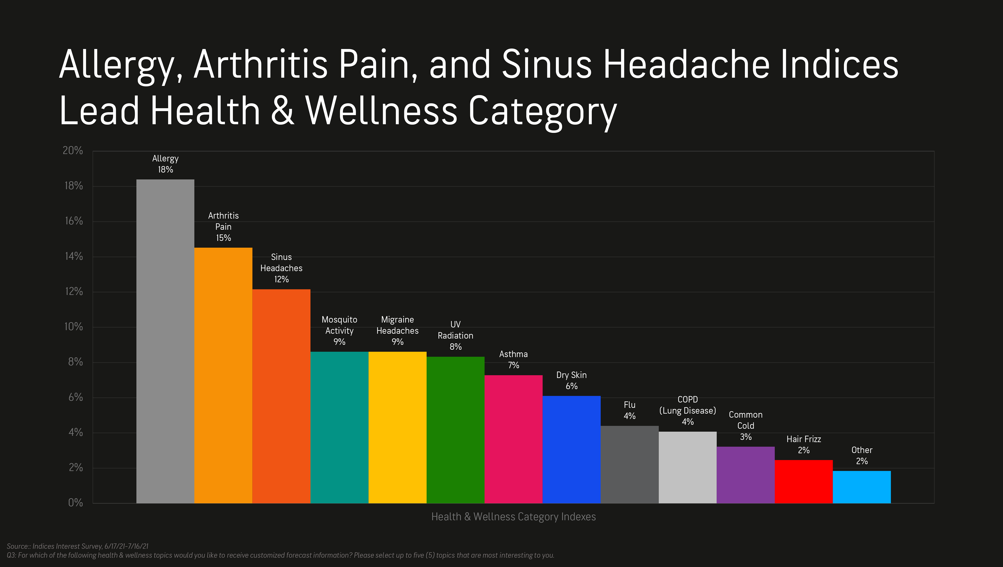
In order to better understand which lifestyle interests users cared about most, we launched a survey using Qualtrics. which intercepted 1.3K respondents on AccuWeather.com. We combined the findings with behavioral analytics.
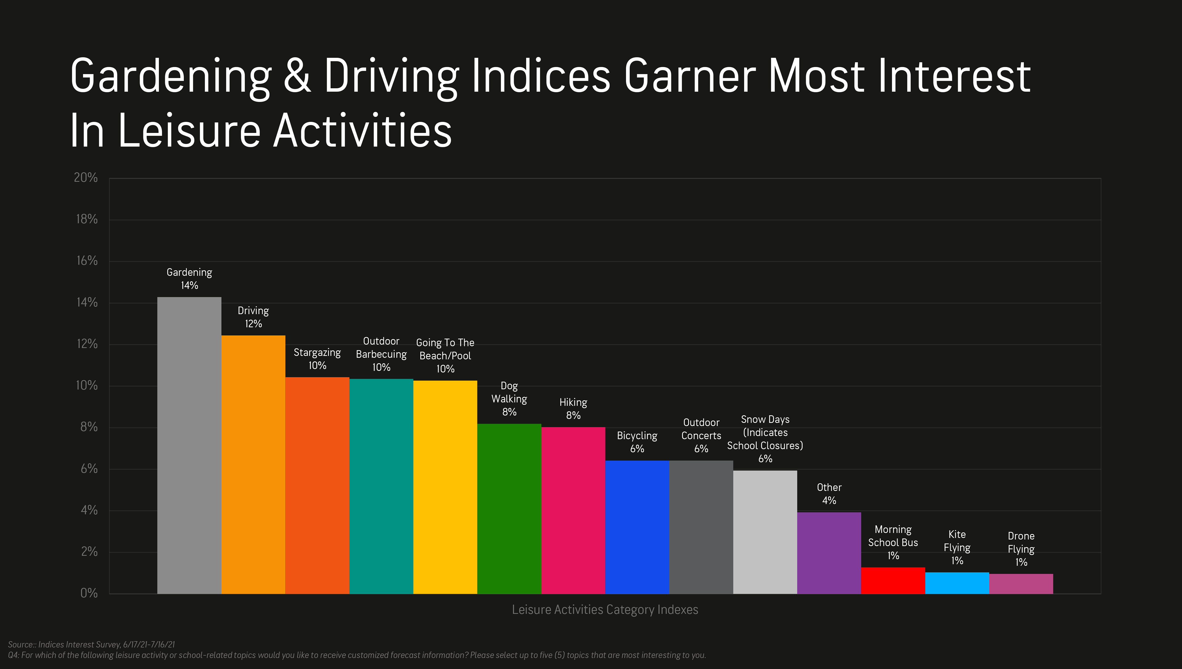
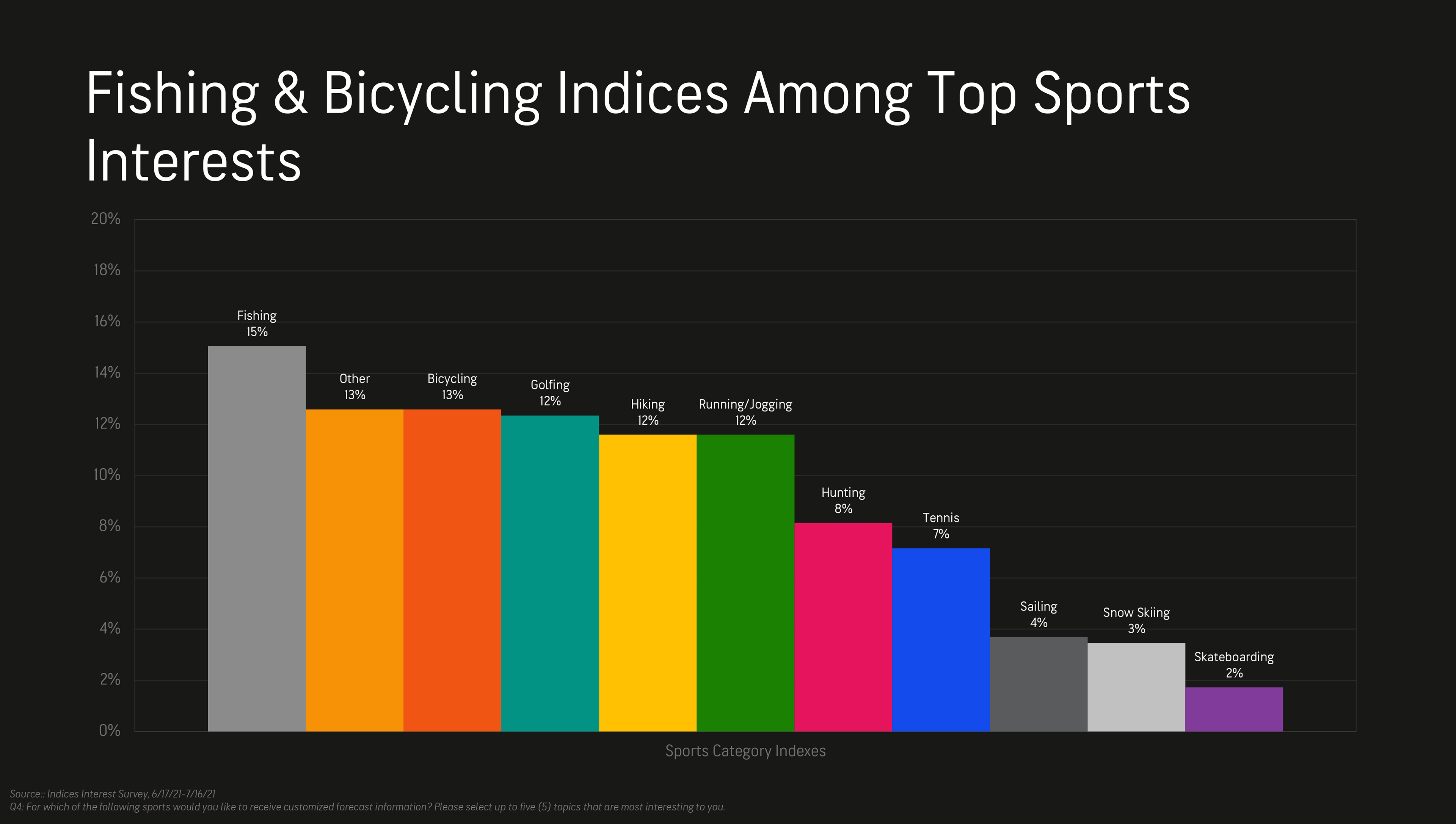
Key Findings
•Allergies, arthritis pain and sinus headaches garner the most interest in the health category.
•Gardening and driving resonated most in the leisure category.
•Fishing and biking topped the sports category, but stargazing was also popular.
Web: Strategy
For web, the strategy was to create a hub that made it easy for users to visit and find the indices they cared about most. However, we only wanted to present indices that were valuable to users, so the research informed which to keep and which to discard. We also considered other touch points, to drive awareness and funnel users to the hub.
Web: Ideation
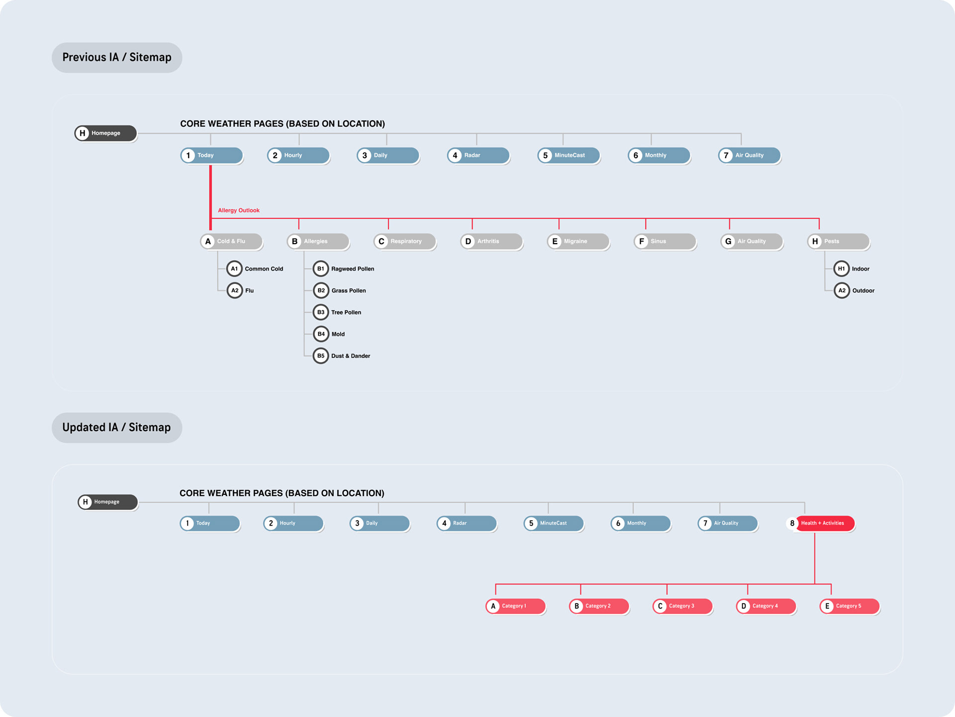
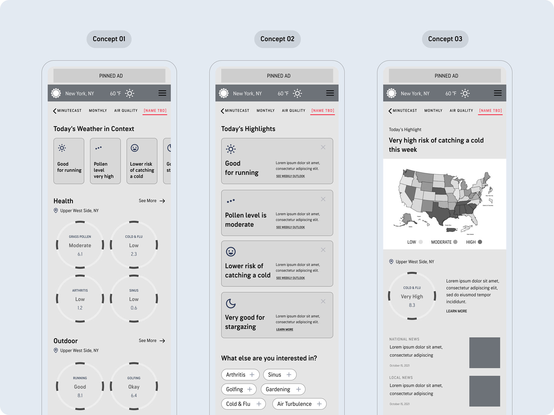
Starting with information architecture, we wanted to not only better organize the indices themselves, but also ensure they were more discoverable. Part of the solution was introducing a flatter navigation model by inserting "Health and Activities" as a top-level navigation item. We also explored the user experience via three different concepts.
Web: Final Direction
New Health and Activities Hub
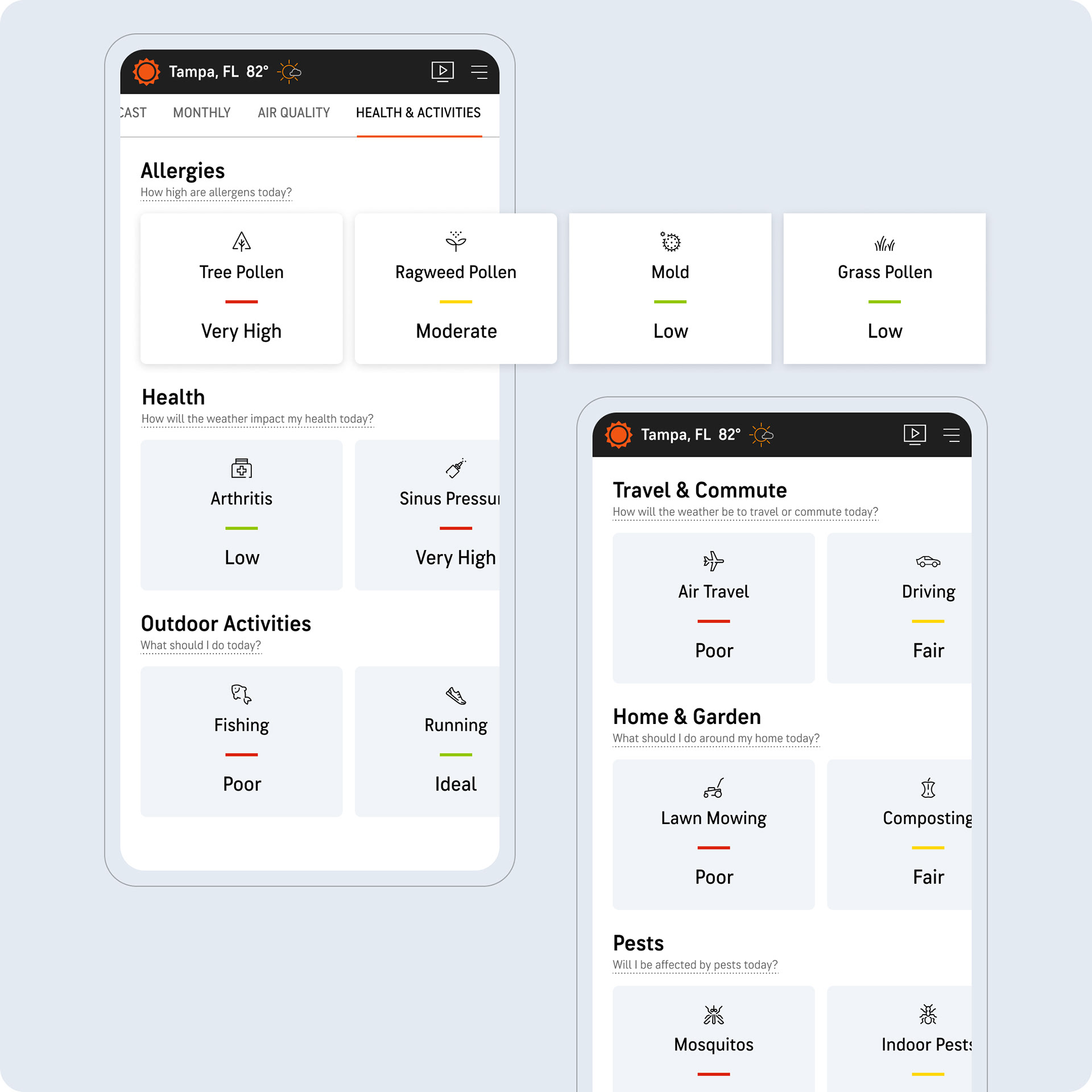
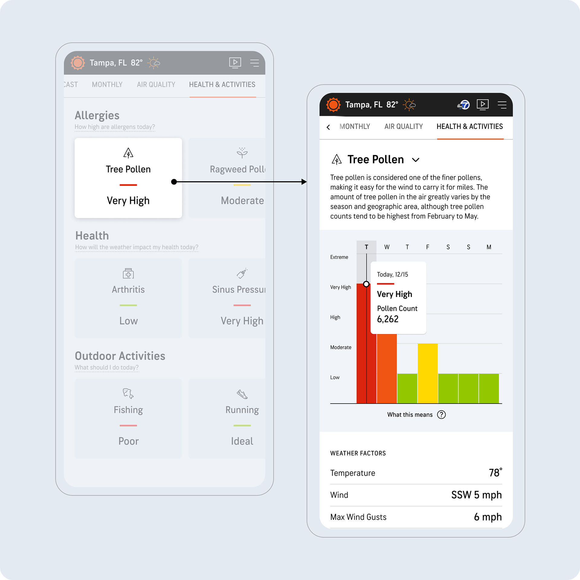
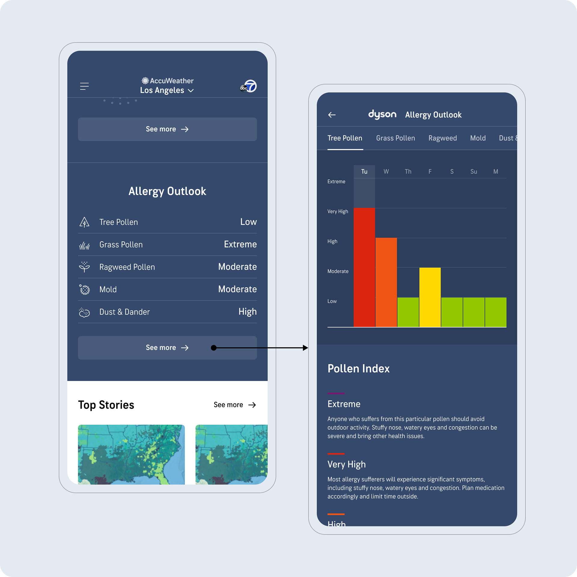
The hub (landing page) houses all health and activities in an organized way, introducing a series of rows for each category with the most valuable categories presented at the top. Depending on the season, we could also move these up/down as needed. We also leaned into education users, providing a tooltip for each category. Here, users can quickly scan across the page, and instantly see the current conditions for each index.
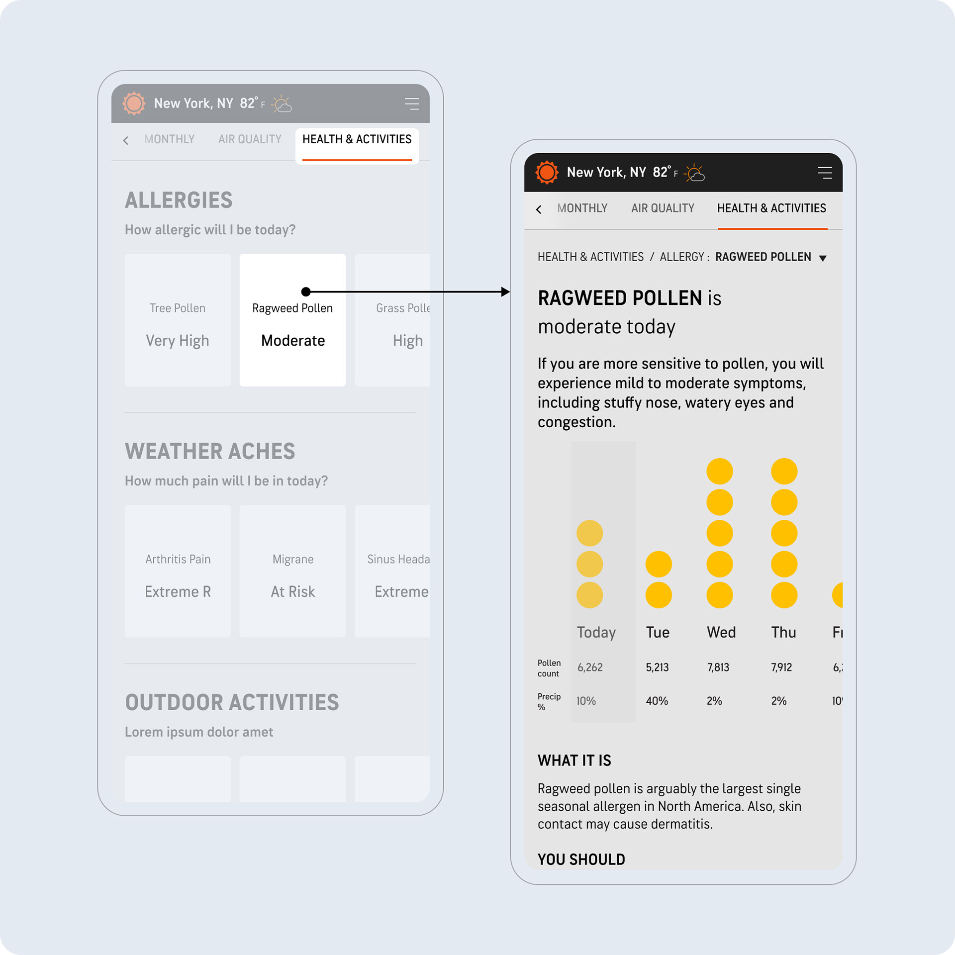
Detail Screen
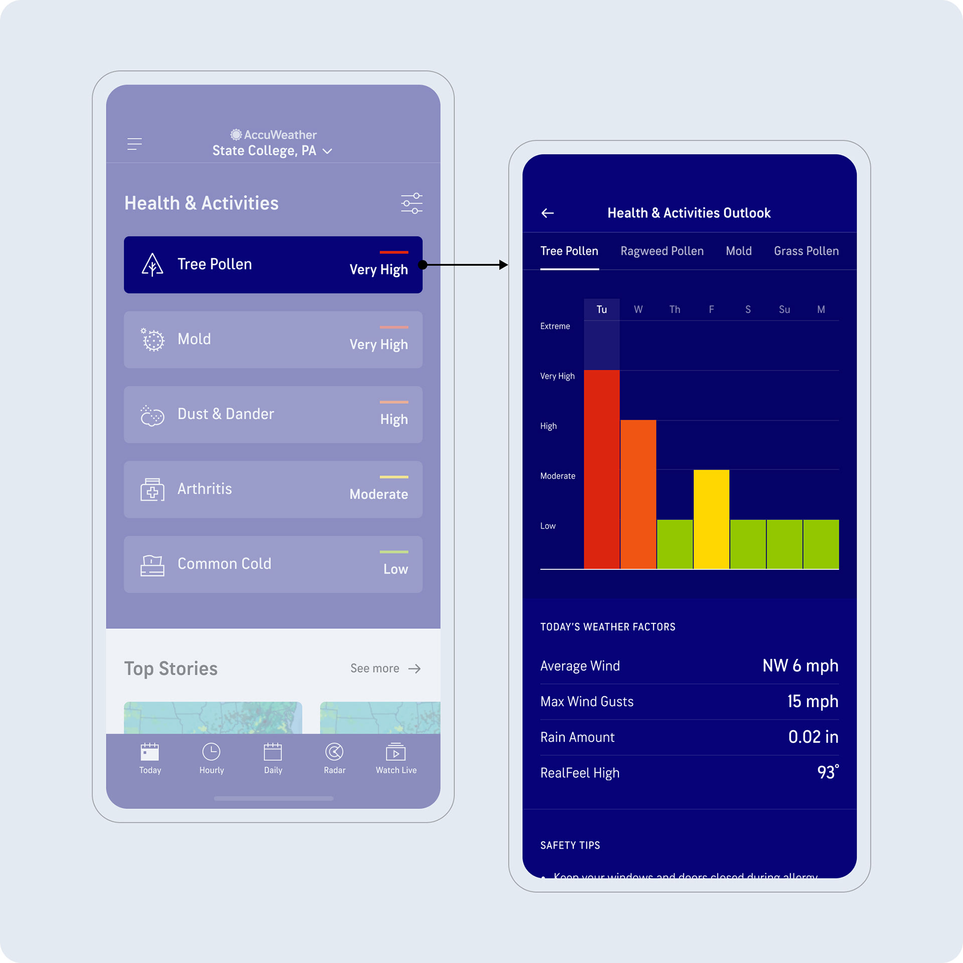
Each index is paired with a detail screen, which provides the 5-day forecast in the form of a graph. Ideally, we wanted to present an hour-by-hour trend chart, but unfortunately only daily readouts were available.
Usability Test
Using an interactive prototype, we conducted an unmoderated usability test with 10 participants on mobile and 10 on desktop, with the main goals being to validate the design direction and make sure that users could find and understand the various forecasts easily.
Overall Reactions
•Adjectives used to describe: informative, useful, engaging, interesting, easy, organized, colorful, “life-saving.”
•Very positive reactions to the Index Detail page.
•Appreciated the weekly outlook chart and safety tip recommendations.
Navigation
•Participants easily found their way to the Index Detail page, and expected to find more information there.
•The majority of desktop participants navigated to another page by clicking a card within the “Related Indices” row.
•The majority of participants navigated to the hub by clicking on “Health & Activities" in the top navigation.
Scrolling Behavior
•All participants scrolled to the bottom of the pages.
•Many found the ad banners to be too big, but it did not stop them from scrolling.
•Swiping through the rows was easily achieved by all users.
App: Strategy
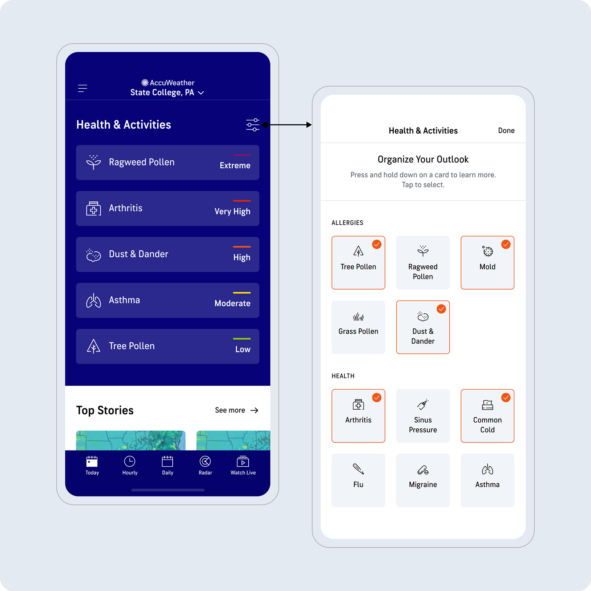
For the mobile app, we wanted to add health personalization as part of the Premium+ subscription. This would be achieved by enabling users to select their "favorites". We also wanted to ensure that we embraced graphs/charts as a way to easily display trending forecasts over the 5-day period.
Previous Experience
Note how only allergies were included in the previous experience.
Personalization
By adding the personalization control, users can favorite the Health & Activities that matter to them. To continue the education theme, users can long hold on the tiles when favoriting. This triggers a tooltip that explains what the index is about. Each Health & Activities row on the Today screen was also designed to be tappable, driving users into a detail screen with more information.