The Problem
The hourly page displayed a vertical list of temperatures, which made it difficult for users to identify the hour-by-hour trends for forecasted data points such as temperature, precipitation, air quality, UV index, wind, and humidity.
The Goal
Create a data visualization that enables users to easily look at hour-by-hour trends for additional data points, and make the Premium+ subscription more valuable to existing users, while also attracting new subscribers.
My Role
Directed the UX/UI team throughout the project and ultimately presented an interactive prototype to the CEO.
The Outcome
•Upsell placements drove more traffic to the subscription landing page than all of the other upsell entries combined.
•Saw over a 700% increase in Premium+ subscription monthly revenue, with 3x conversion rates.
•Created positivity and motivation to create more interactive graphs.
•Established data visualization patterns to be incorporated on web and other experiences.
•Gained credibility with the CEO, demonstrating the value of the UX/UI team.
Project Details
Company: AccuWeather
My Role: Senior Director, User Experience
Platform: iOS, Android
Team: UX/UI, Product, Engineering, Meteorology, QA
Year: 2023
Research
Realizing that hourly data visualization would be a big part of the Premium+ subscription tier, we wanted to ensure we properly assessed the competitive landscape, and spoke to weather app users to hear their thoughts.
Competitive Analysis
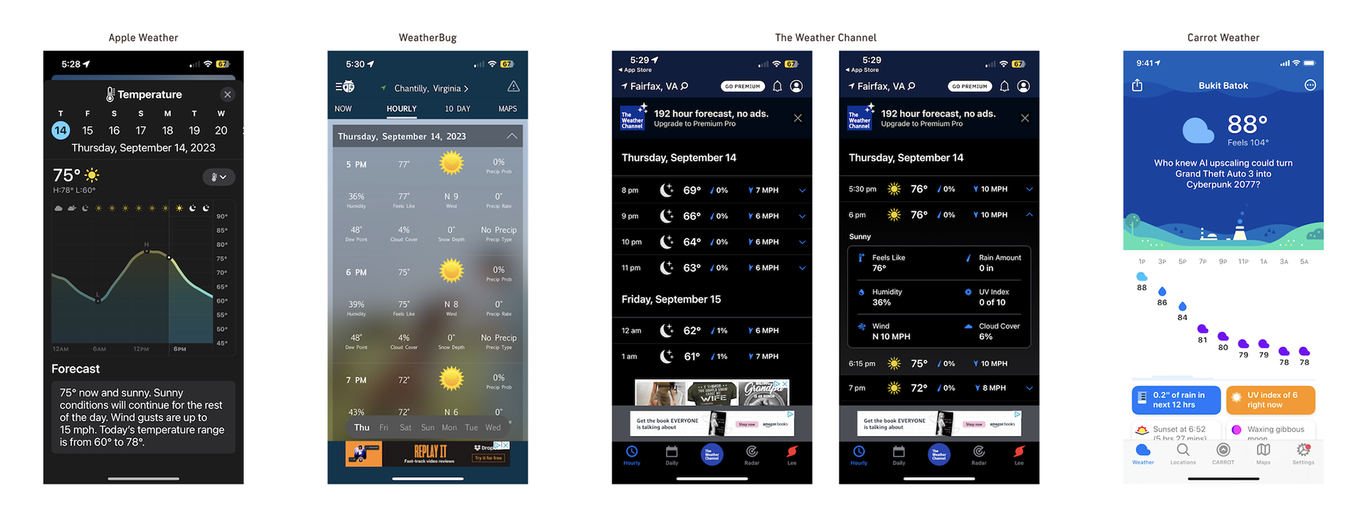
Most of our weather app competitors either had just a Graph view or a version of a List view to display hourly weather data. Both views had their pros and cons, but the Graph view is best for a quick overview of the entire day but harder to gauge the specific details of each hour. On the other hand, the List view includes the details but lacked the quick, scannable experience. Apple Weather in particular, made significant improvements with data visualization, and this was something we wanted to keep up with.
User Interviews
The UX Design team interviewed users, asking how they viewed the hour-by-hour forecast on their favorite weather app. These insights would help us determine the biggest pain points and strengths of the different Hourly views available, and also the context behind the use.
“I usually use [the Hourly page] to get a general idea of what the weather will look like during the day, usually the first thing in the morning. Most important data for me is the chance of rain and the peak and low temperature of the day.” - Corporate employee who works from home, 26 (Main weather app: Apple Weather)
“I like looking at the details for specific hours every day since I have a consistent schedule of when I’m outside dropping my kids off at school or picking them up. Otherwise I’m usually inside so I don’t need to know every detail of every hour.” - Parent with strict daily schedule, 35 (Main weather app: Weather Channel)
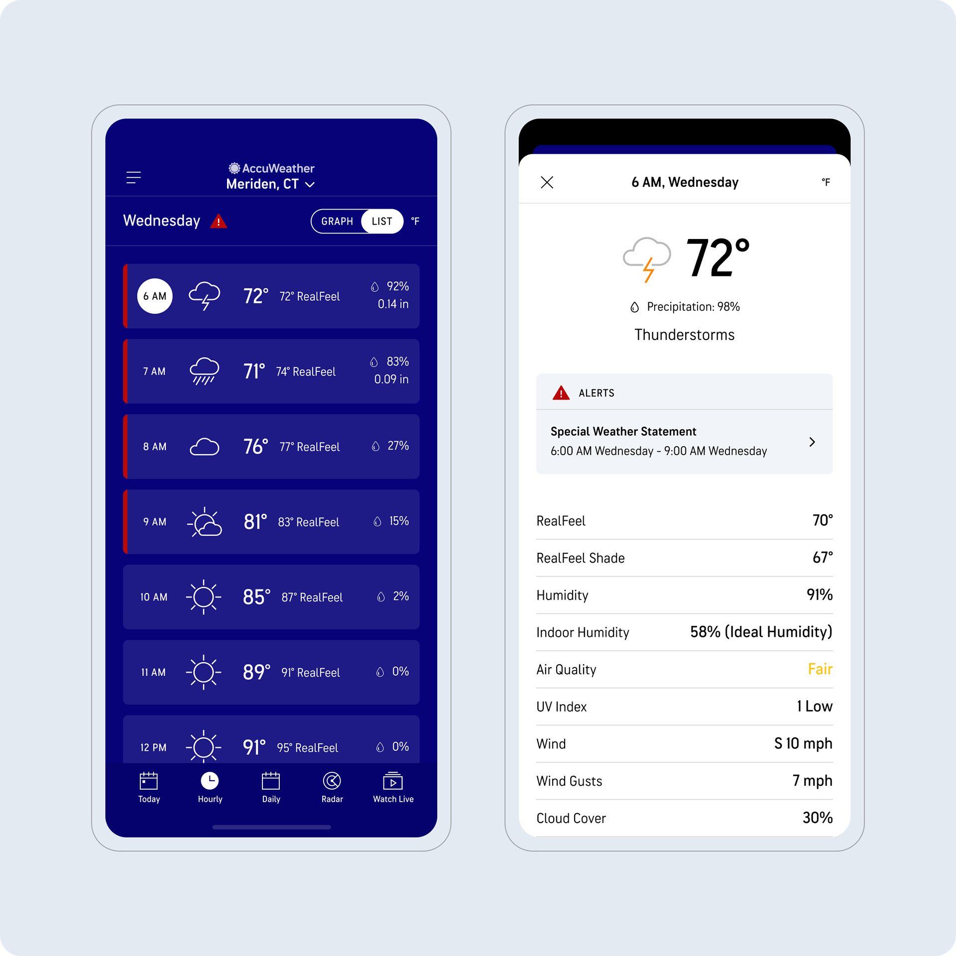
Existing Hourly Screen
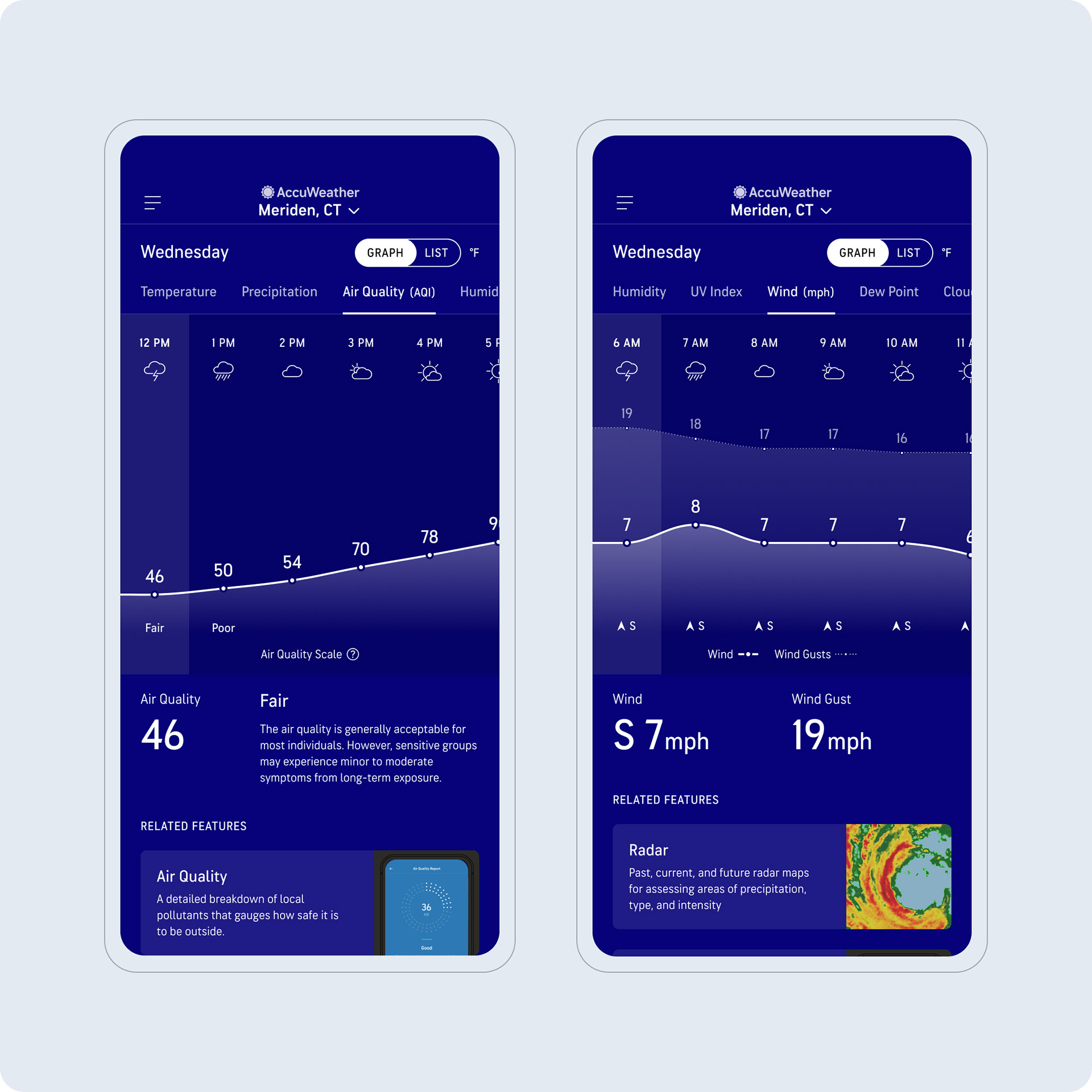
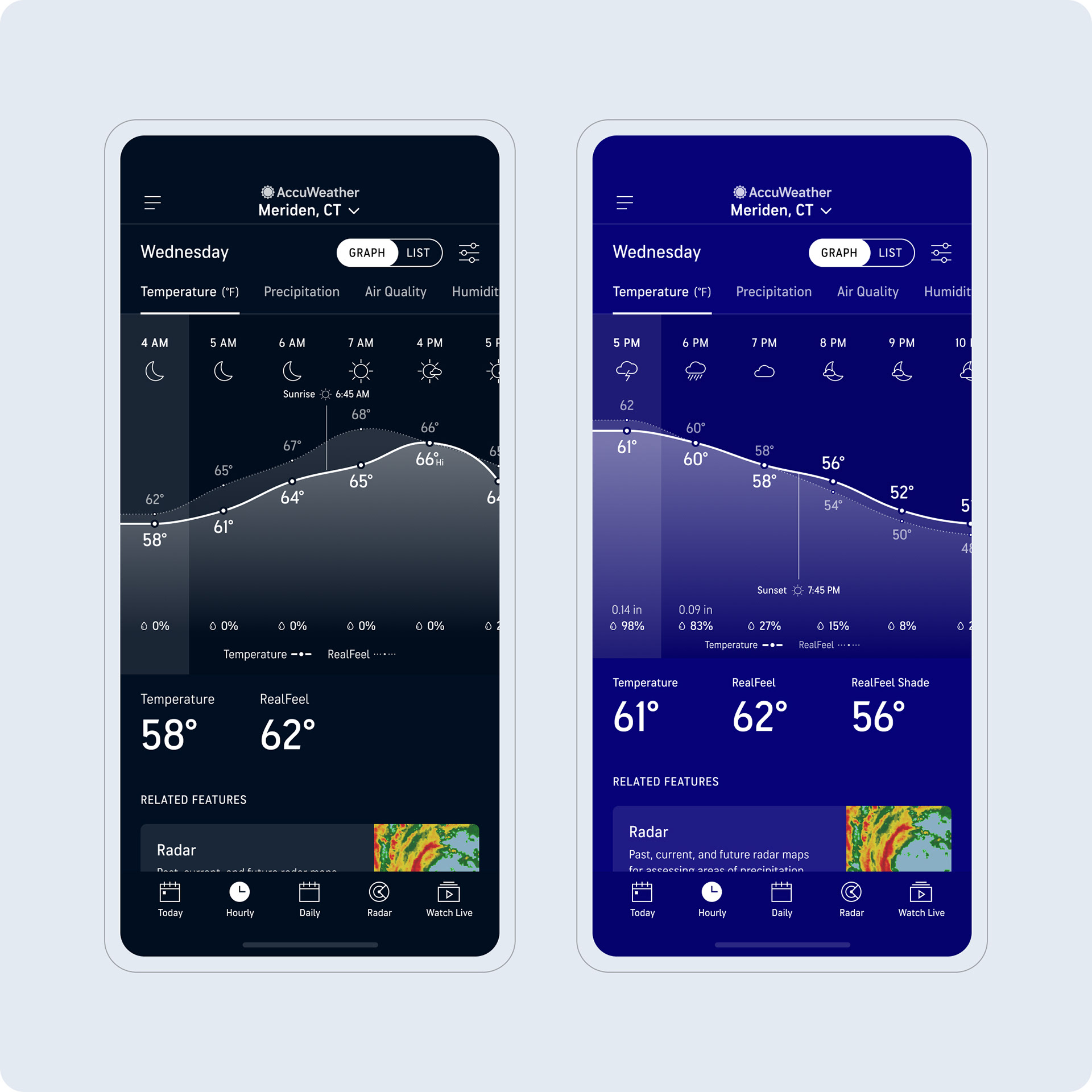
The existing AccuWeather Hourly screen only had a List view, which makes it challenging to spot temperature trends at a glance. Furthermore, to get access to additional datapoints, users must tap into each hour to see the likes of air quality, wind, humidity, and more.
Strategy
For adding an additional data visualization (graph) view, we wanted to make sure we carefully put together a smart strategy to ensure we found the right balance going into design. Historically we've found our users to be upset when we change things.
•Retain the List view and display as this as the default view to ensure a soft landing for users.
•Include basic data points for free users and do not take away any information they already get for free.
•Make it easy for users to switch between the List and Graph views.
•As users favor different forecasts depending on their context of use, let them prioritize datapoints as they see fit
•Ensure severe weather messaging is integrated (Alerts, Winter Storms, Hurricane Tracker, etc.)
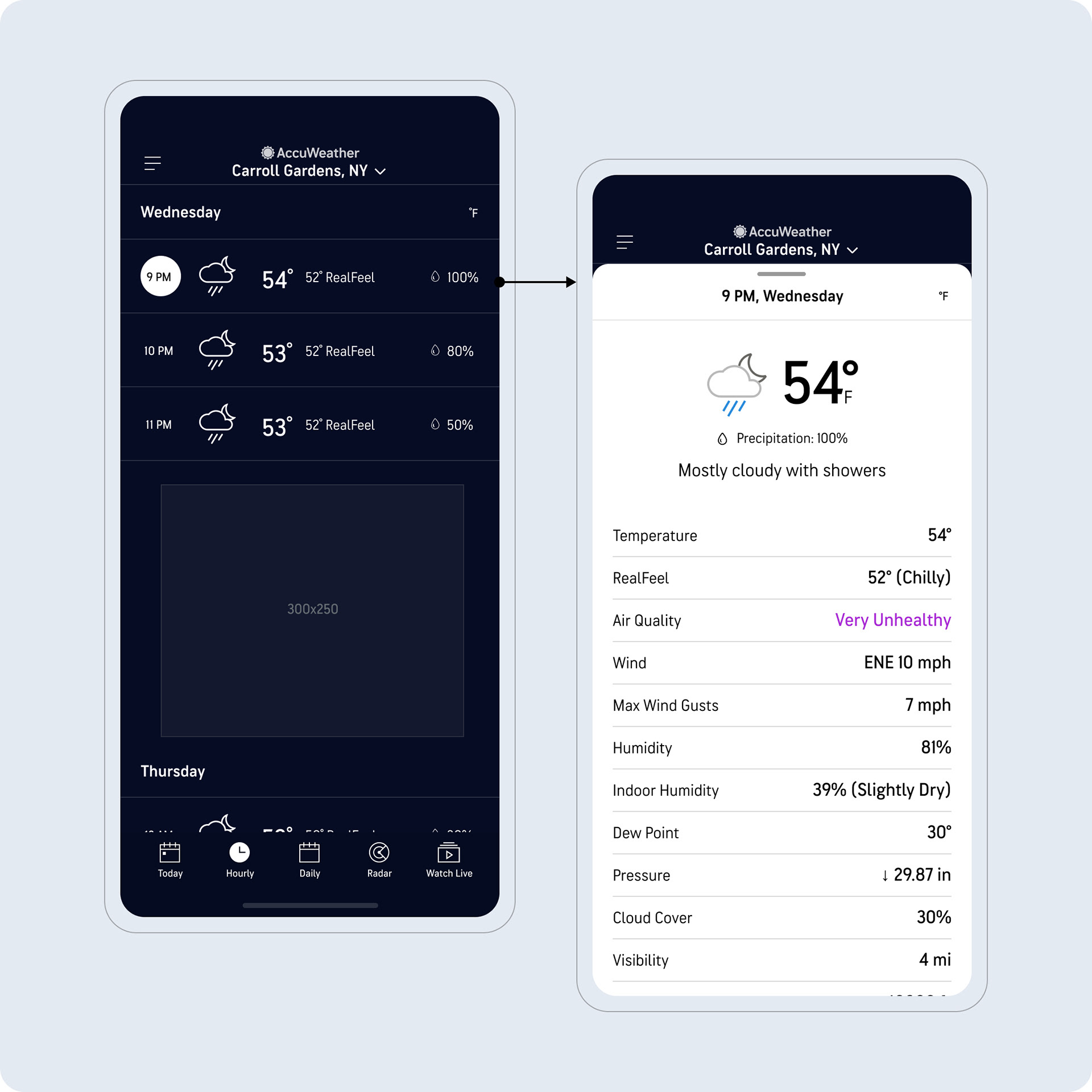
•Still enable users to access the sheets which display all the datapoints.
•Lean towards line graphs, as this type visualizes trends more clearly.
•Consider multiple lines on a graph if datapoints are related E.g. Temperature and Realfeel.
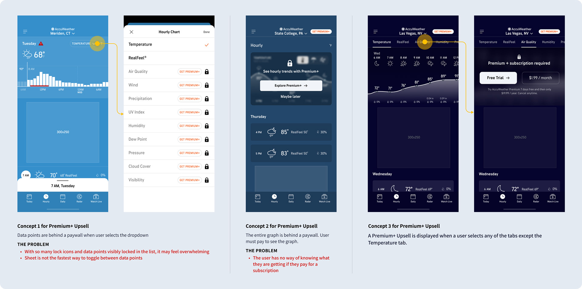
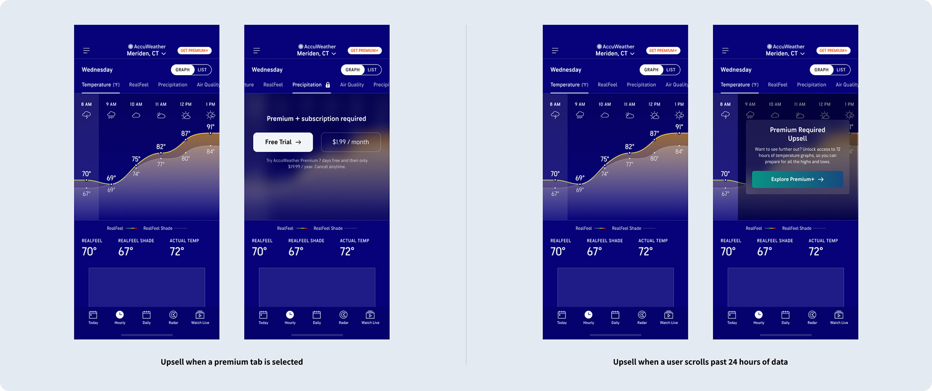
•Integrate upsell messaging so that users know they have to pay to get access to additional graphs.
•Cross-promote related features in the app.
•Include tooltips to help users familiarize themselves.
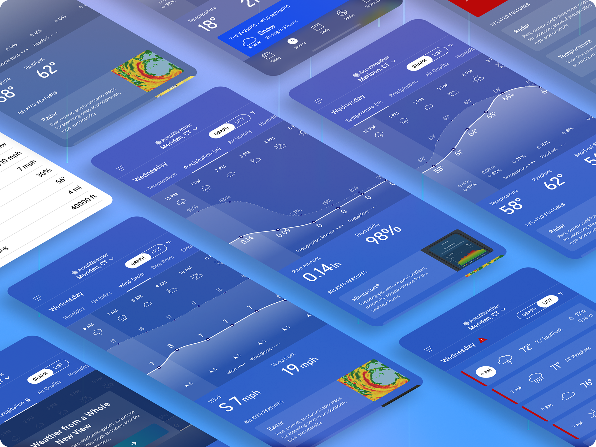
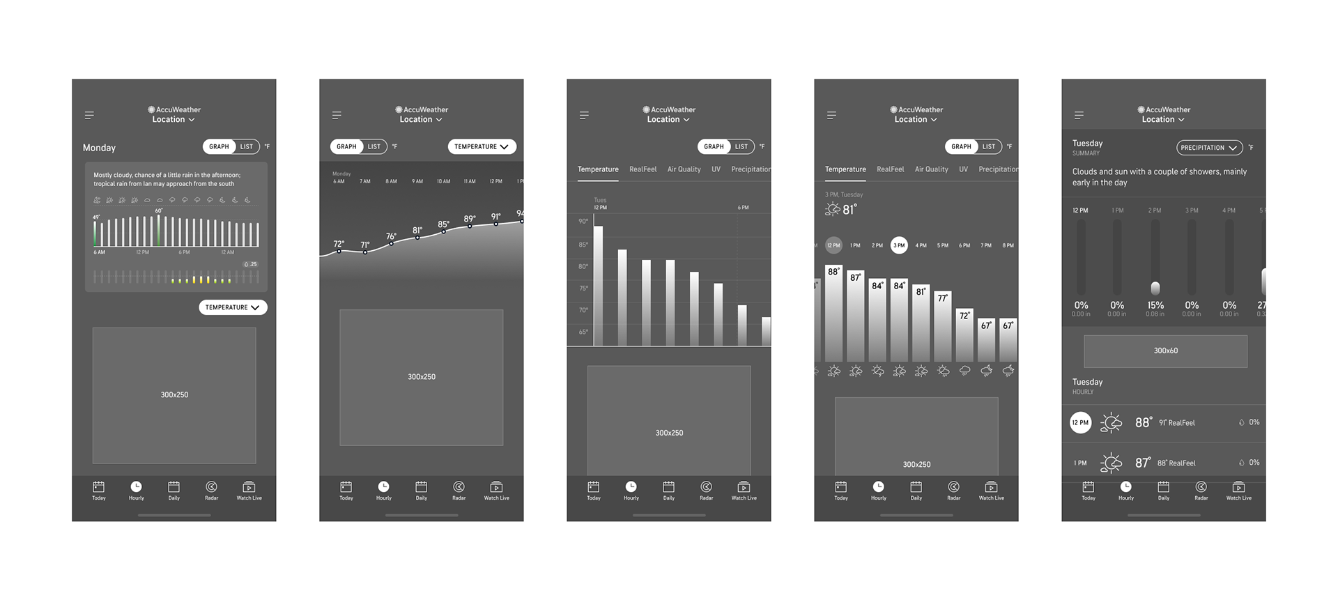
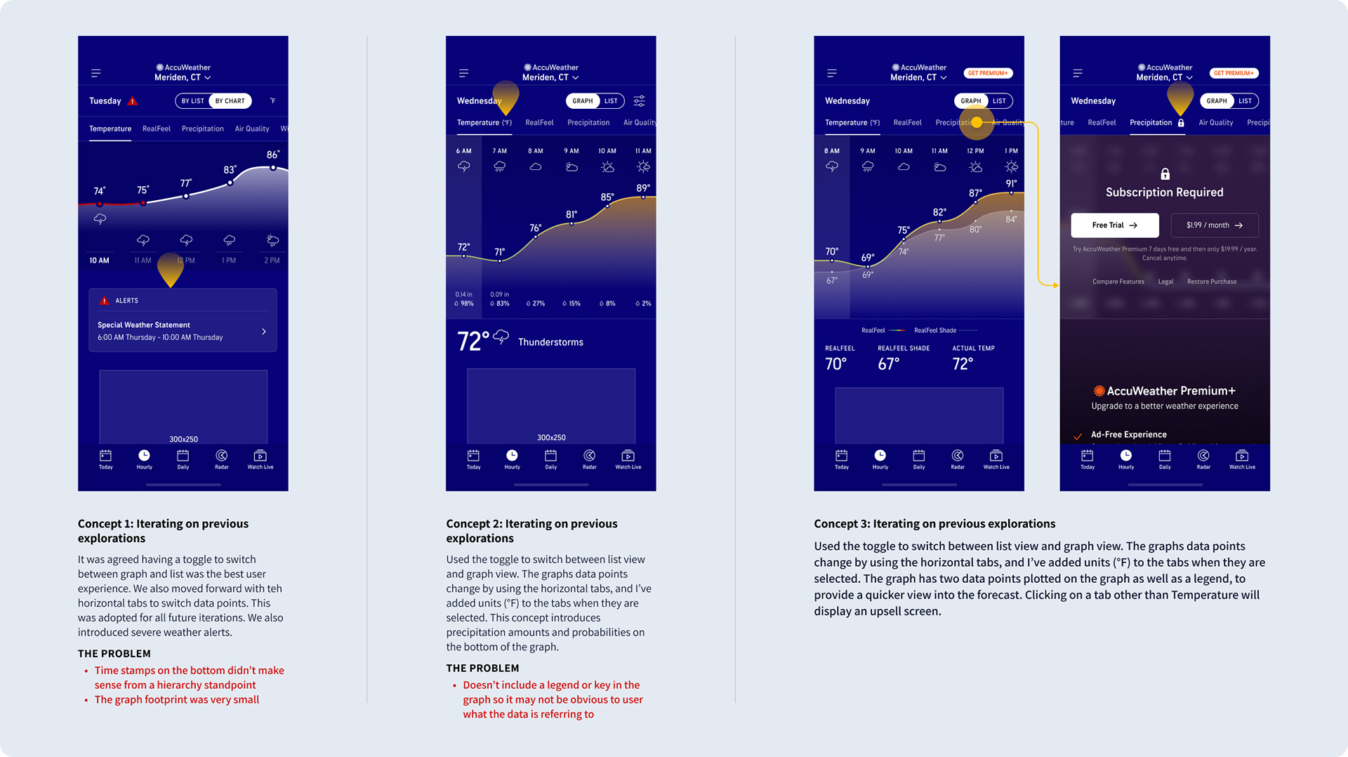
Ideating: UX Explorations
The UX team explored how the List and Graph view could coexist, and how users could switch between the different forecasts. It was also important to ideate through different ways to visualize the hourly data, and also look at Premium+ upsell integration in different spots across the interface.
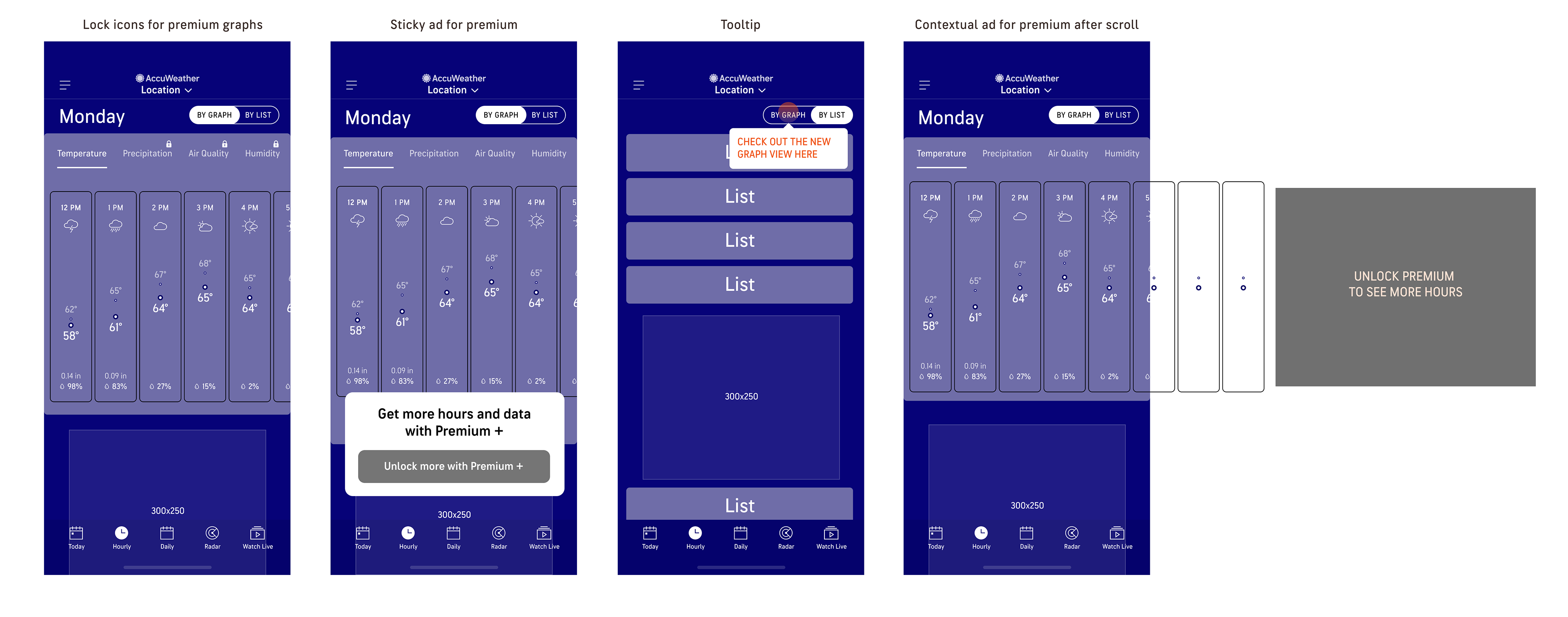
Ideating: Visual Design
The UI team explored different graph styles, interactions, upsell approaches, and ad placements. However, some concepts were not without their problems.
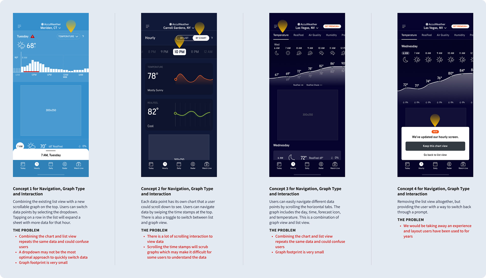
Continued Exploration
Taking positives from the initial concepts, patterns such as the List/Graph toggle, graph navigation and upsell integration started to solidify.
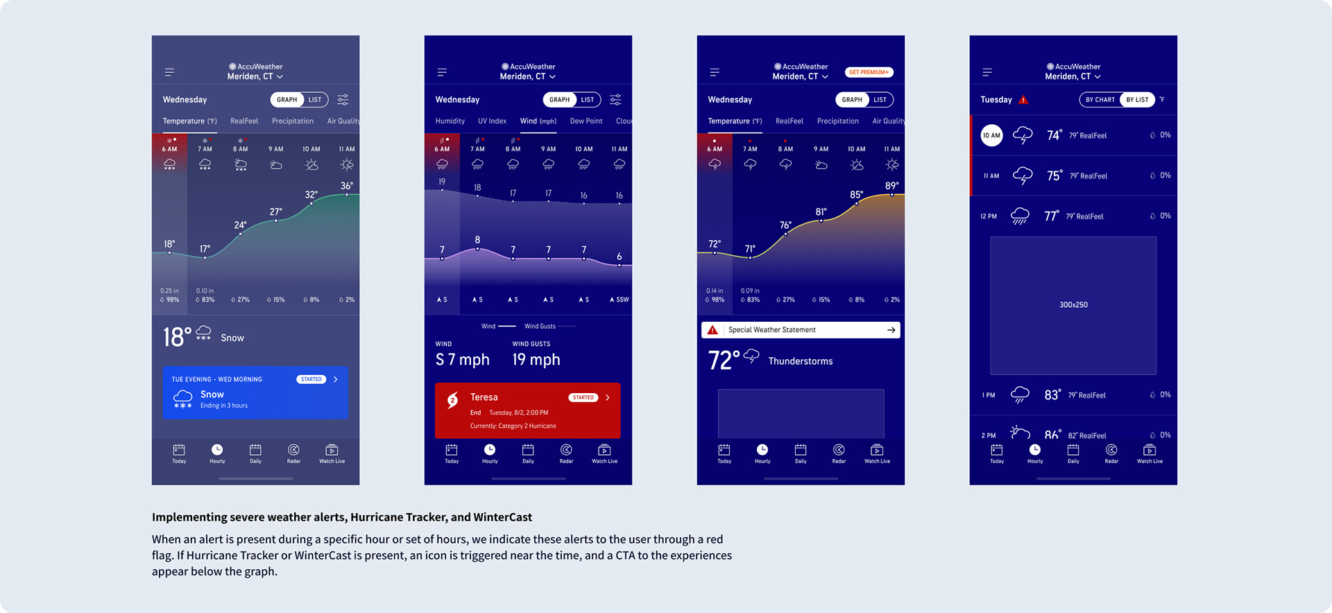
Severe Weather Messaging
Severe weather alerts, Hurricane Tracker, and WinterCast were integrated into the new experience. This would highlight specific hours impacted by severe weather and provide users with an easy way to access other features within the app to track tropical and winter storms.
Usability Test
After multiple rounds of exploration and reviews, the UI team built an interactive prototype using Figma. This would then be used by the UX team to run an unmoderated test for both the free and premium experiences using a series of tasks. In doing so, we were able to validate the usability and desirability for the proposed experience. Overall, the test was a success as most participants liked the graph view for its clear visual presentation and information shown at a glance.
Findings
•70% of participants said they found the Graph view more useful than the list view.
•75% of the participants navigated to the Graph view, unprompted.
•While on the Graph view, 70% interacted with the Temp graph by dragging horizontally, unprompted.
•While on the Graph view, 60% checked out other tabs, seeing the upselling CTA on those premium tabs.
•Nobody had any issues understanding the graphs themselves and consuming the information.
•55% of participants saw the upselling CTA at the end of the free Temperature graph.
•30% tapped on a specific hour and saw the Hourly sheet.
•65% said they would not upgrade or would need more information to decide.
Quotes
"Personally I'm not a big fan of graphs, as they remind me of math." - Ryan, 45
“I see a lot of information at once without having to scroll with a graph compared to the List view.” - Everett, 39
“I would pay up to $2.99 for Premium+, specifically for Precipitation and Humidity graphs.” - Allie, 28
“Graph view is better because you’re getting the most information, best of both worlds, and I love being able to visually see the high and lows at once.” - Krishna, 27
Final Designs
After thorough exploration and usability testing, we landed on a set of final designs to build and launch. However, because of time sensitivity, we had to delay the ability to reorder the different forecast tabs to a subsequent release.
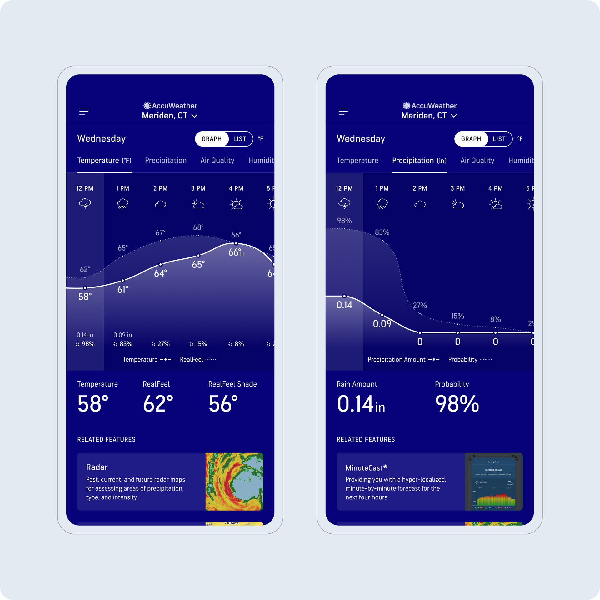
Sunrise and Sunset
Sunrise and sunset information were displayed within the graphs, ensuring that users could easily reference these datapoints as they moved through time.
List View
We retained the list view because users still saw a lot of value in it, and we also made it more usable by making each hour row appear more "tappable".