The Problem
•Originally only focused on snowfall, leaving a void of a true comprehensive outlook
•Only showed one storm at a time, even though multiple storms were forecasted
•Snowfall map was not robust or intuitive
•Charts were not interactive and only showed one snow event
•Only showed one storm at a time, even though multiple storms were forecasted
•Snowfall map was not robust or intuitive
•Charts were not interactive and only showed one snow event
The Goal
The goal of WinterCast is to provide users with the most comprehensive winter weather experience and to help them prepare for incoming snow and ice conditions that will impact their location. Users can easily access WinterCast through the core weather experience whenever any snow or ice is predicted for the users current location.
My Role
TBD
The Outcome
WinterCast has become a reliable tool for users who live in areas where winter weather has negative impacts on travel and plans. Users can easily plan ahead through WinterCast alerts, visualizations, and winter map layers.
Project Details
Company: AccuWeather
My Role: VP, Product Experience
Platform: iOS + Android + Web
Team: UX/UI, Product, Engineering Meteorology, QA
Year: 2022
Research and Strategy
Interviews with meteorologists and stakeholders revealed some opportunities for improvement. However, we wanted to check with users through some usability studies to determine usefulness and preference for some components within the experience.
Opportunities for improvement
•WinterCast made readily available by covering all snow and ice events in 5-day period
•Display both snow and ice probabilities
•Implement interactive snow, ice and temperature graphs for high level view of intensity
•Expansion of maps to show snow plots
•Create module on other pages to get users into WinterCast
•Display both snow and ice probabilities
•Implement interactive snow, ice and temperature graphs for high level view of intensity
•Expansion of maps to show snow plots
•Create module on other pages to get users into WinterCast
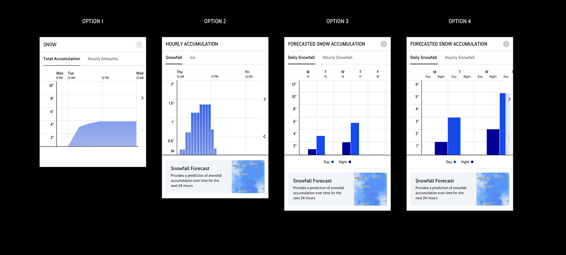
Hero Explorations
Three different options were explored, each leading with a different "hero" for the WinterCast screen.
•Option 1: Daily Graph
•Option 1: Daily Graph
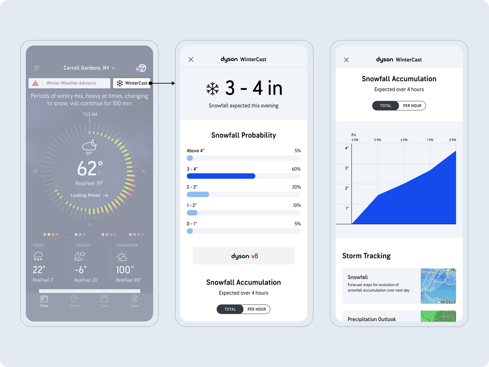
•Option 2: Map
•Option 3: Probabilities Chart
Hero Usability Test
Objective
Determine which “hero” will be most useful for users in the WinterCast experience.
Approach
•60 participants, 18-55.
•Located within the US who experience snowfall as part of their daily life.
•Tested three different “hero” options, with their journey starting on the Today screen’s WinterCast CTA.
Findings
Daily graph hero (Option 1)
•The bars align to the concept of a snow pile, making it feel very intuitive
•Looking across days is better for looking ahead and planning
•Including numbers over each graph will help make the graph even easier to interpret
•Shows the expected snowfall amount very clearly (large datapoint)
•Better for more immediate/impactful snowfall
•Usefulness: 4.4/5
•Preference: 40%
Map hero (Option 2)
•Not enough information (no snowfall amounts)
•May appear more useful if the day-by-day controls were visible without having to enter “full screen” mode.
•Some participants were still open to having a map at the top of the screen if it was more useful
•Usefulness: 2.5/5
•Preference: 3.3%
Probabilities hero (Option 3)
•Gives valuable details with probabilities and clear time frame
•Seems more “honest” in showing multiple probabilities
•Usefulness: 4.2/5
•Preference: 57%
Key Takeaways
Most participants had a hard time choosing between Option 1 and 2, understanding the pros and cons for each. While the daily graph is seen as slightly more useful, it appears that the probabilities chart might be preferred because it draws more attention to the upcoming storm, which might be more important than planning beyond the event.
Chart Usability Test
Objective
Determine which snowfall chart(s) will be most useful for users in the WinterCast experience
Approach
•60 participants, 18-55
•Located within the US who experience snowfall as part of their daily life
•Tested four different snow chart options, with Option 1 being what we currently offer in WinterCast.
Findings
Option 1
•“Snow pile” or “Depth chart” terms used to describe the chart
•Best representation of “accumulation”
•Might be useful to show after a storm as well
•Usefulness: 4.3/5
•Preference: 25%
Option 2
•Feels more granular –“I feel in the know”
•Bars feel more accurate (compared to the option 1)
•More visually appealing
•Still some confusion if this represents accumulation or snow falling each hour
•Requires users to add up each bar to get totals (work for the user)
•Some would like to see dates
•Usefulness: 4.0/5
•Preference: 42%
Option 3 & 4
• Good for seeing the entire week
• Like the dates and days
• Appreciated seeing totals, but didn’t want to add up day and night
• Like the dates and days
•However, there’s some ambiguity around what a day and night is – “Maybe I don’t see days and nights as you do”
•Don’t like having to “scroll” to see the full week in Option 4
•Usefulness: 3.7/5 and 3.8/5
•Preference: 15% / 18%
Key Takeaways
• While Option 2 is seen as the preferred chart, mainly because of its more granular hourly visualization, Option 1 is still clearly very useful and provides a valuable and alternative visualization for seeing a snow pile accumulating over time.
• There is still room to improve Option 2, to ensure that users do not interpret the bars as “accumulation” and “melt”. E.g. use a more accurate title that avoids the term “Accumulation”
• Some users just don’t like charts because it requires them to “work”– “they remind me of math, and I don’t like math”
• Still an opportunity to provide guidance on decisions like: When to travel? When to shovel? Etc.
• Charts should be seen as secondary ways to consume information. Users still expect to be given important information clearly and quickly, without requiring them to “figure” things out.
Final Designs
Based on the findings from the usability studies, we landed on an ideal direction. These are the final designs of the screens contributing to the WinterCast experience.
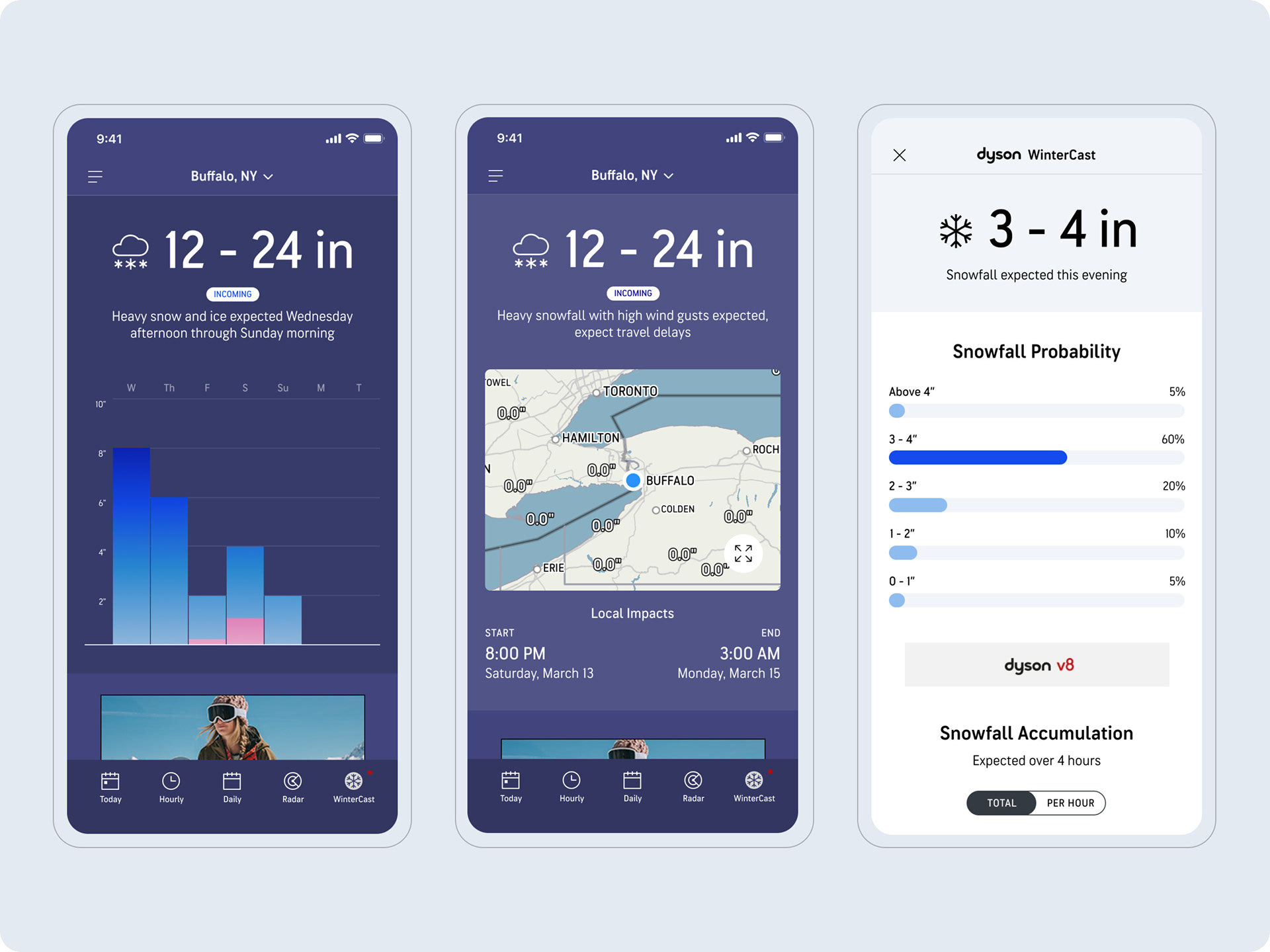
Entry Points
Today page banner and conditional 5th tab entry points into active and upcoming snow and ice events.
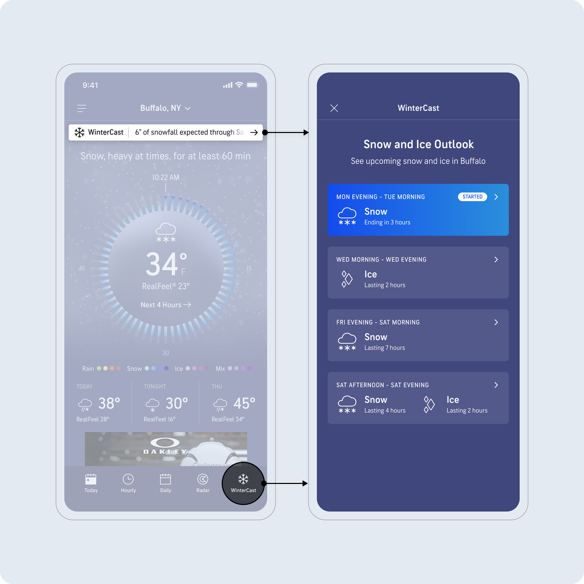
Storm List
Storm list provides active and upcoming storms in a chronological list. A "Started" flag adds to the clarity of an active storm.
Storm List With Ice
Users can access active and upcoming ice storms. Note that ice/snow are differentiated by colors.
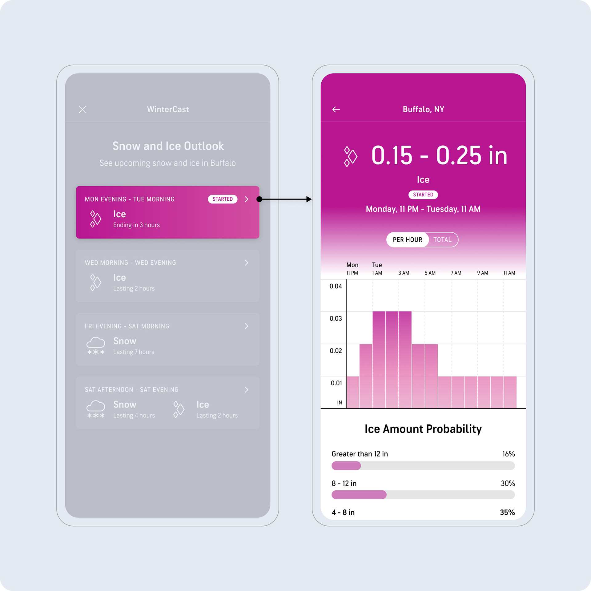
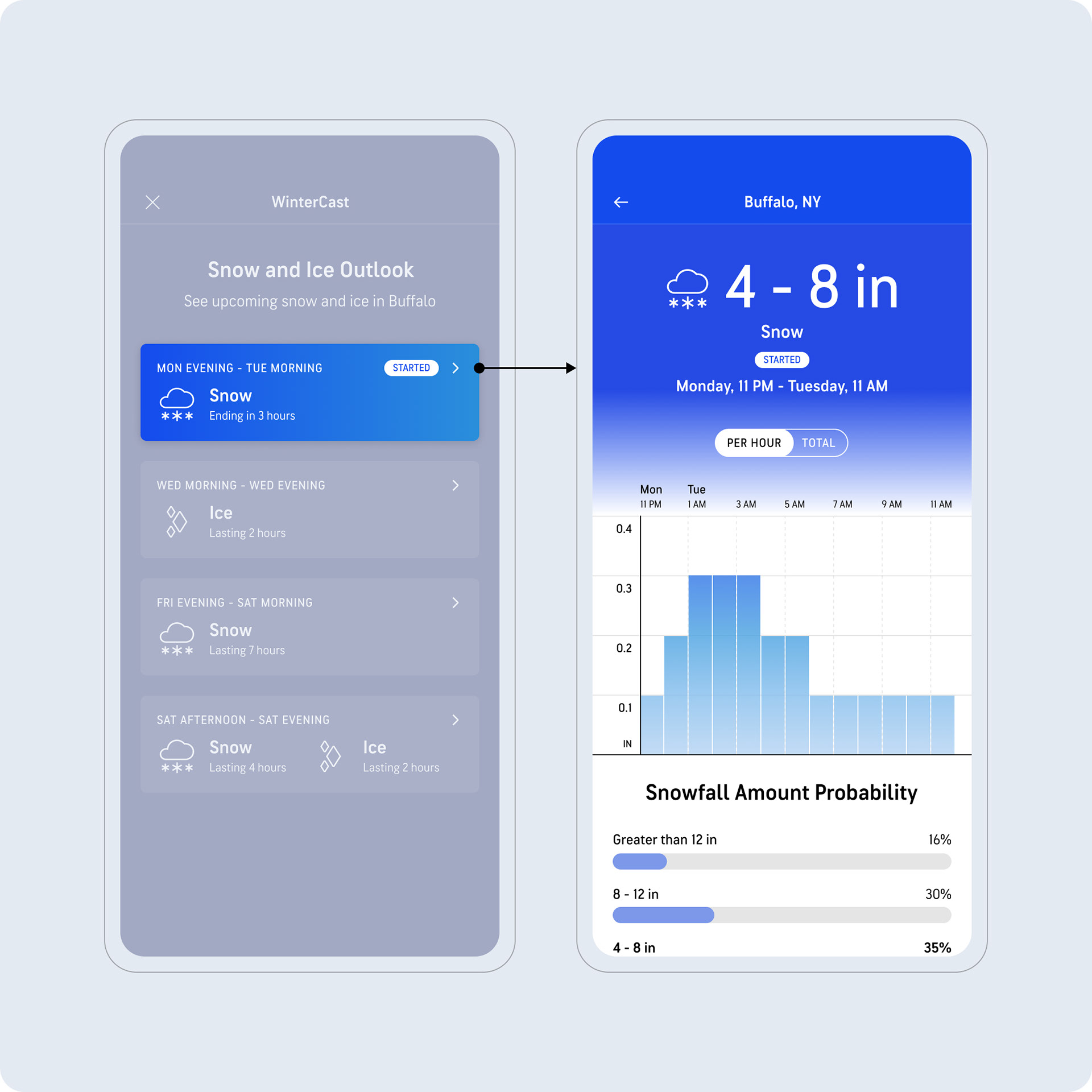
WinterCast Detail
We decided to lead with the hourly chart, given how useful users saw the granularity of an hourly accumulation being.
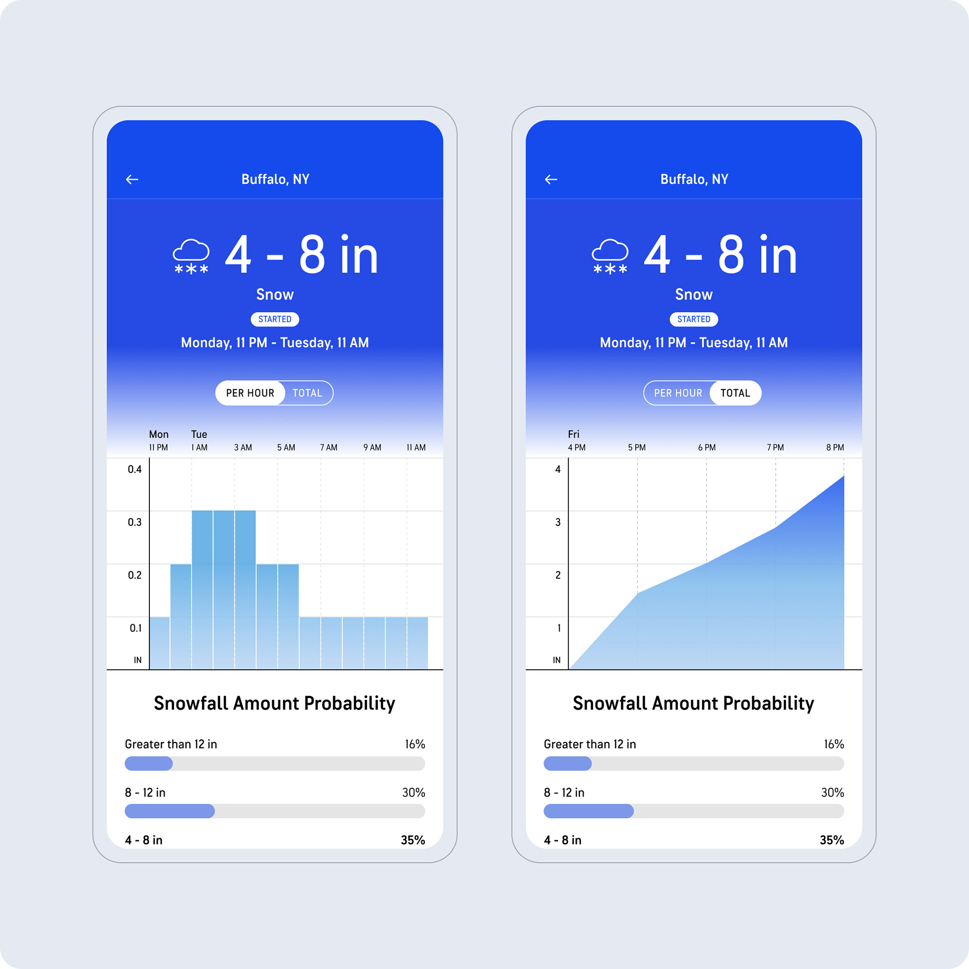
Snowfall & Ice Probabilities
Snow and ice probability charts, continuing the different colors.
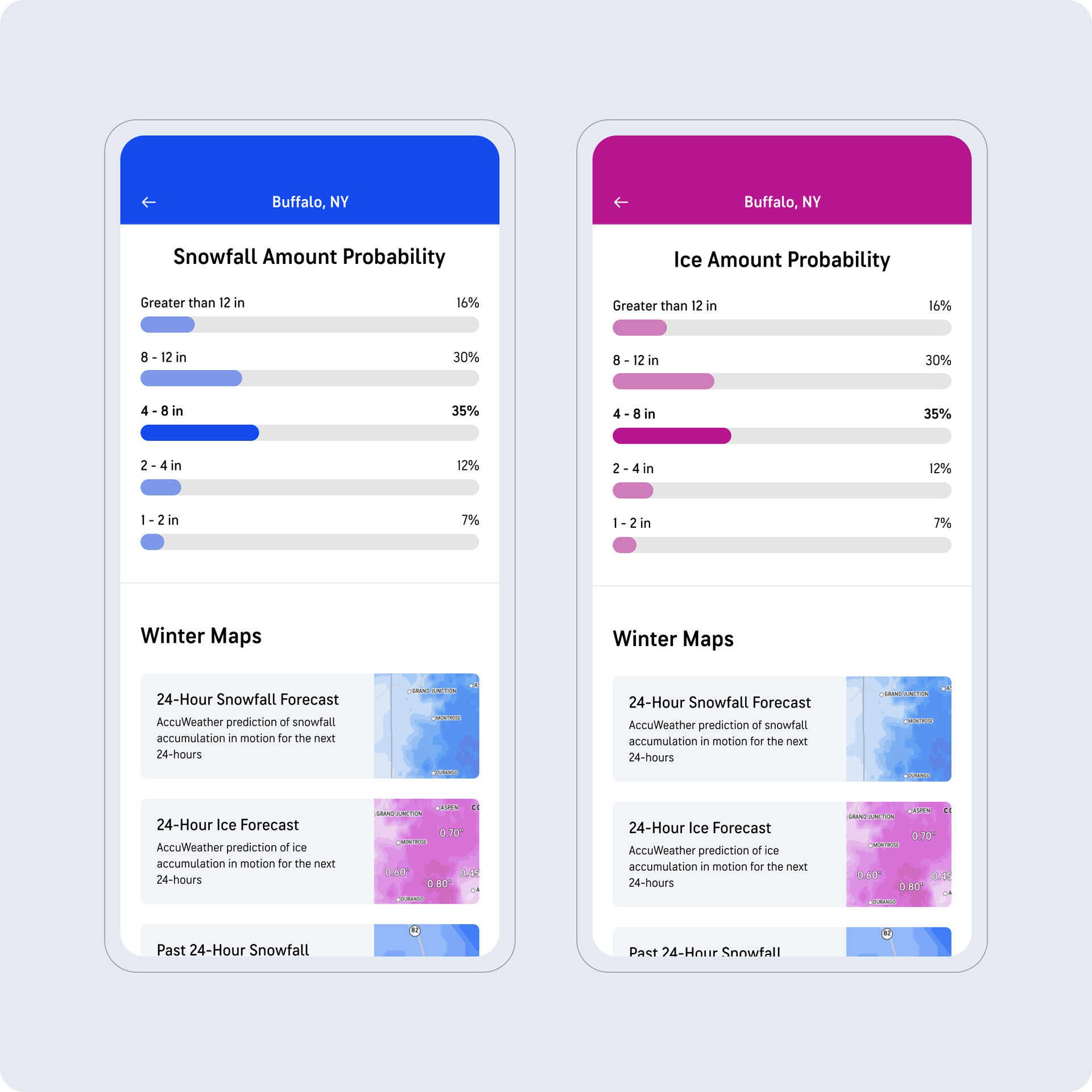
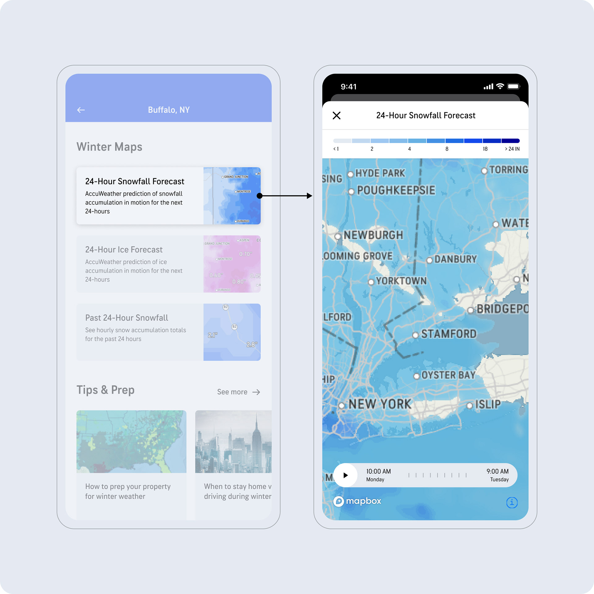
Winter Maps
Tapping on the map thumbnails opens up a full-screen view of the corresponding map, where users can explore impacted areas.