The Problem
With NFL teams only playing a game once a week, a typical fan only visited nfl.com to follow a live game or two. This translated to a fairly short shelf life for the Game Center product. Furthermore, the current Game Center experience felt outdated and didn't have an optimal information architecture for accommodating new content and features.
The Goal
Create an extensible experience that is more engaging and creates compelling reasons for fans to interact with Game Center before, during and after a game -- prolonging the shelf life of the product. Furthermore, Game Center should be a platform for integrating and upselling other NFL products.
My Role
As UX Lead, I was responsible for hands-on UX work and managing a small team of individual contributors: researchers, interaction designers and visual designers. I also ensured that all other teams were involved from beginning to end.
The Outcome
•The launch of the newly designed Game Center increased page views by 134%, and time-on-site by 36%.
•The new "watch tab" increased video streams by 169%, and streams per visit by 70%.
•Raised the bar above NFL competitors such as ESPN.
•Increased sponsorship value with a richer and stickier experience.
•The first NFL experience to allow fan commenting, which then opened up other opportunities.
•Winner of Pluck’s 2009 “Most Innovative Implementation Award” for commenting integration.
•Demonstrated to leadership the value in following a "fan-centered" design process I established.
•Elevated NFL brand, and positioned nfl.com as the "go to" destination for all football fans.
Project Details
Company: National Football League (NFL)
My Role: Manager, User Experience
Platform: Web
Team: UX/UI, Product, Editorial, Engineering, Sales, Project Management, QA
Year: 2009
Research
To kick things off, we launched a survey to better understand fan needs, preferences and behavior. This was key for shaping a UX and content strategy that could hold up throughout the lifecycle of a game. We also conducted focus groups with fans to better understand why and how they used Game Center. We also tapped into existing analytics to establish some baselines.
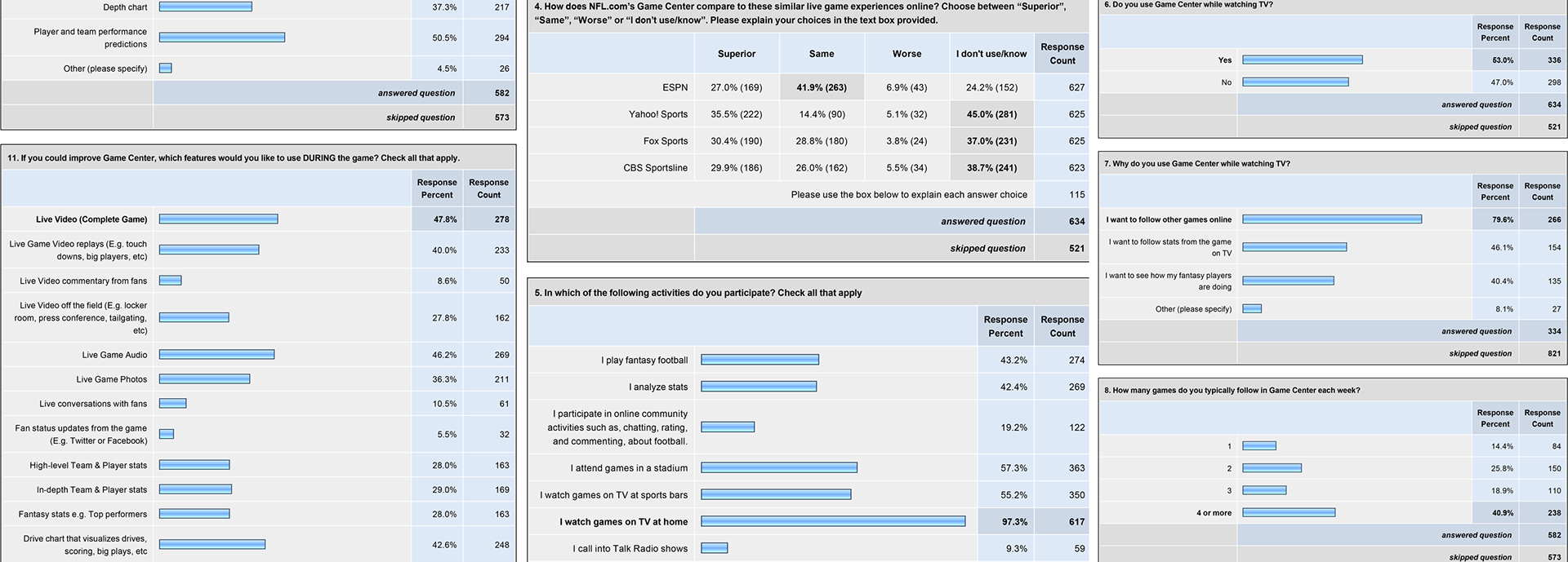
Key Survey findings
•69% visit Game Center after the game, whereas 56% and 47% engaged during and before respectively.
•43% of Game Center users play fantasy football (using Game Center to track player stats).
•53% watch the game on TV while also using Game Center as a companion experience for stats.
•Most desired features before the game: predictive stats, broadcast info, weather forecasts.
•Most desired features during the game: drive chart, video, audio, photos, high-level stats.
•Most desired features after the game: recap articles, video highlights, performance stats.
•Only 10% of fans said they would chat with other fans (however, a vocal minority could still be impactful).
Strategy
Taking this research, we started to shape a UX and content strategy to ensure Game Center's redesign would offer significant improvements for NFL fans.
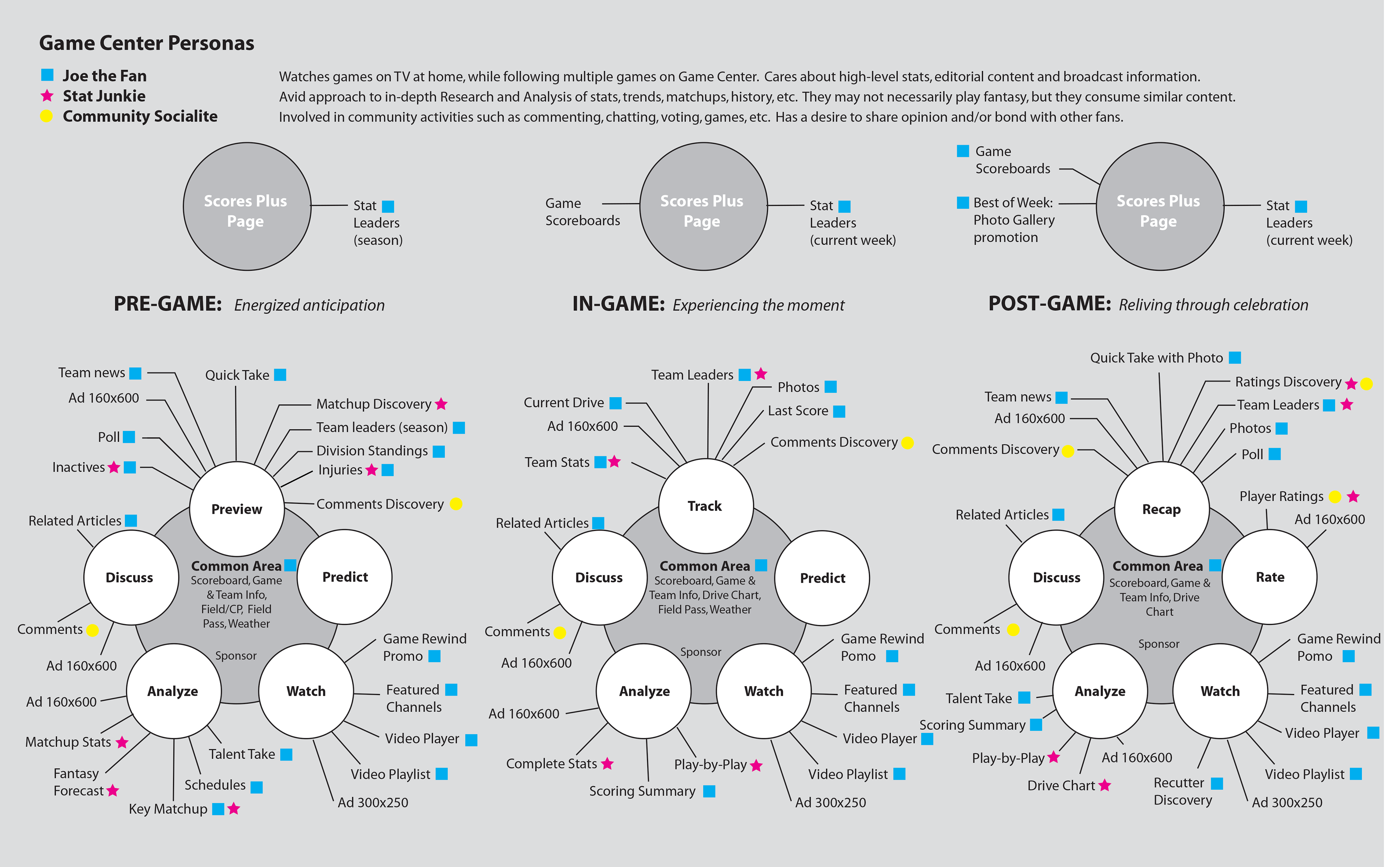
Design for Key Personas
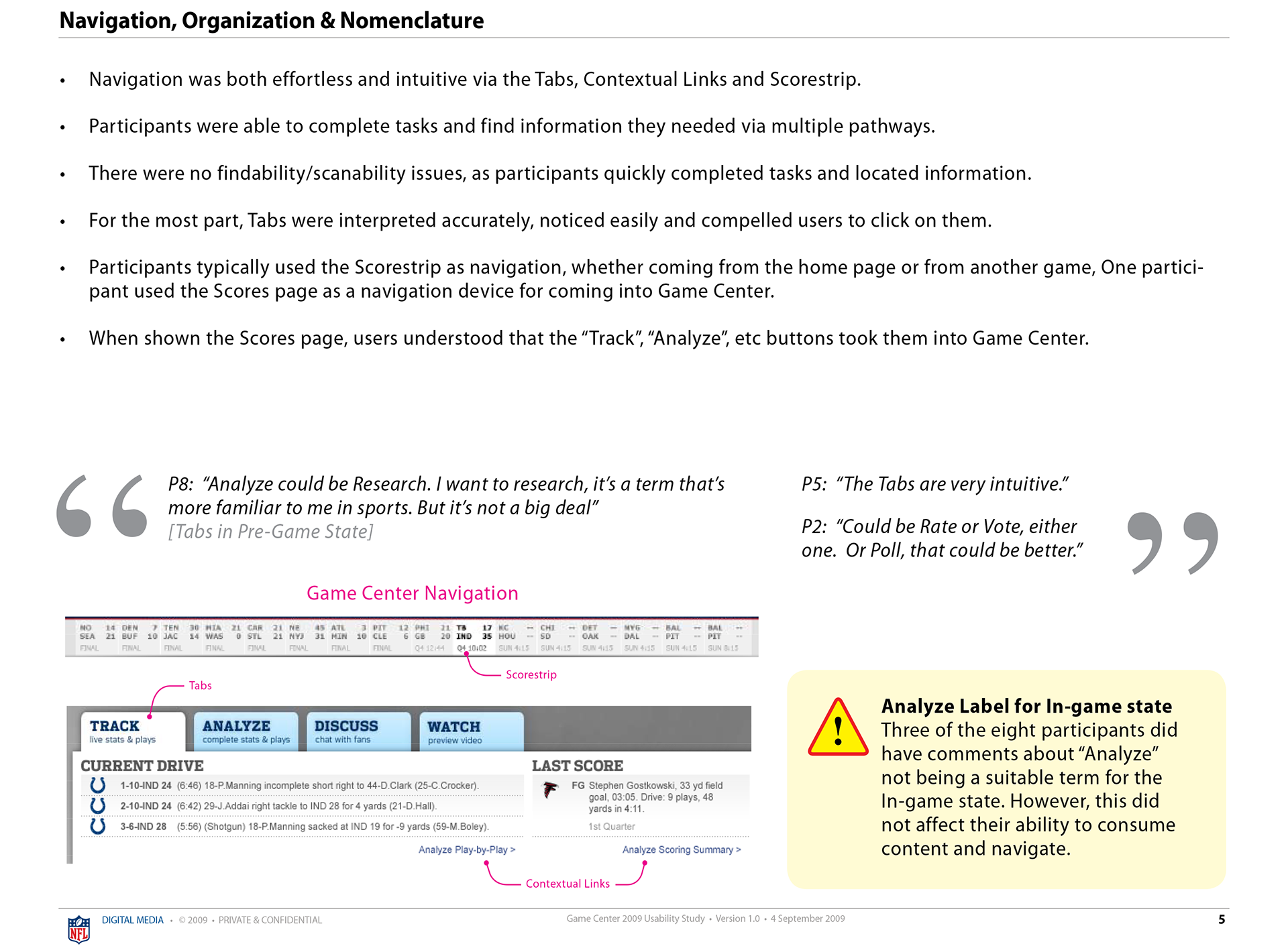
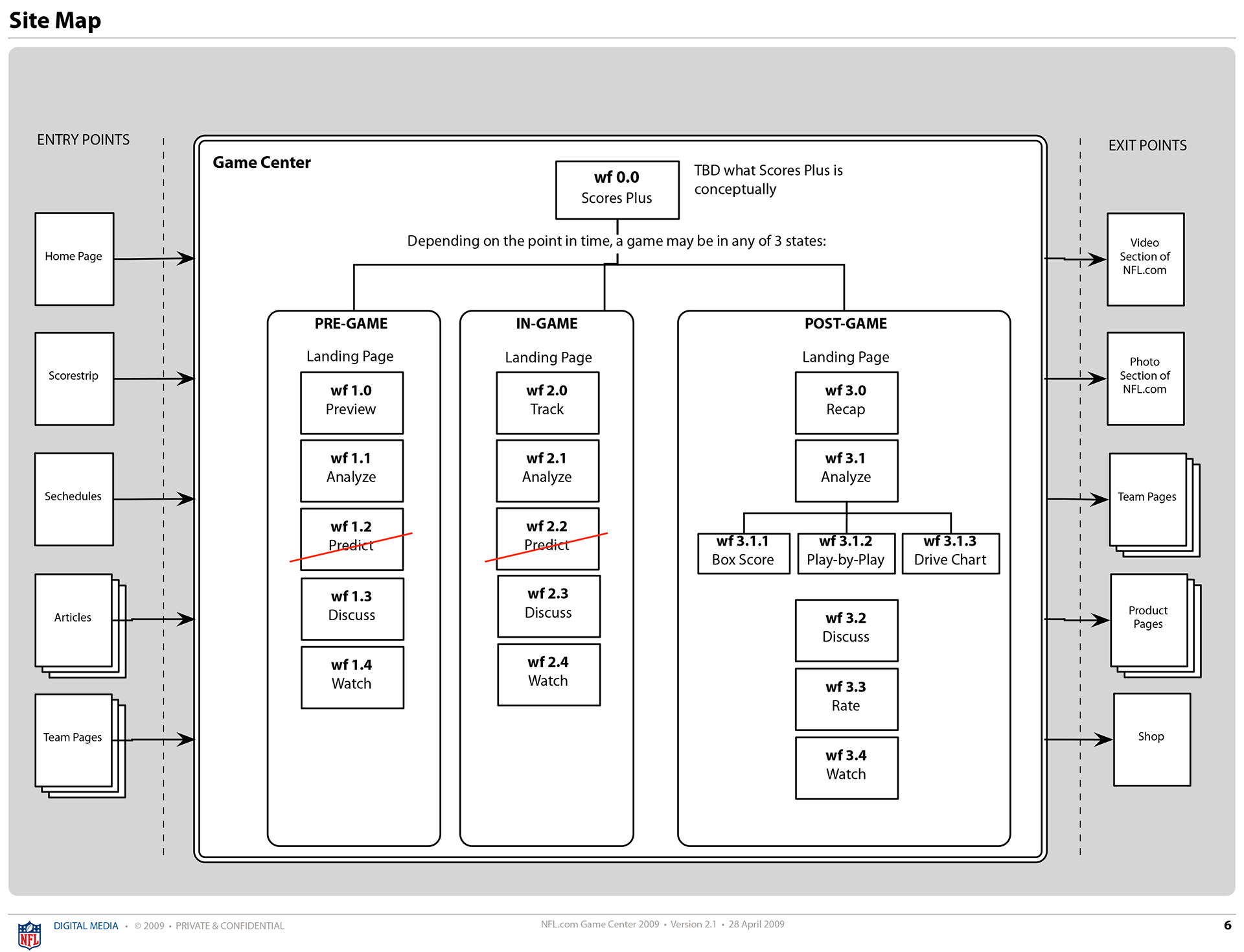
Three core personas were identified, and using these I created an extensible information architecture that could flex gracefully throughout a game's lifecycle. Note the activity centric organization and nomenclature, which was intended to resonate with a fan's mental model and is also broad enough to accommodate new features and content over time. This was controversial at the time, as it deviated from sports labeling conventions.
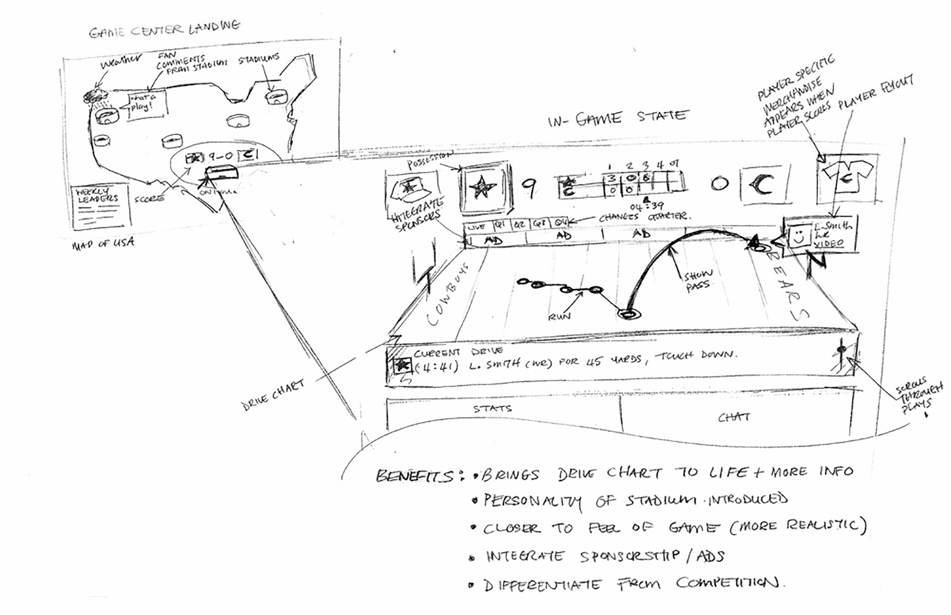
Level-up the Drive Chart
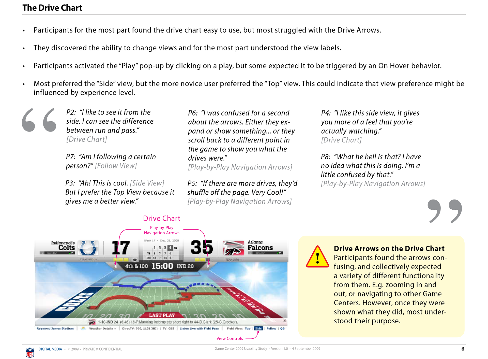
The vision here was to make the drive-chart the beating heart and hero of the experience, and so I started with sketches to play out what that could look like. The existing drive chart was displayed as a top-down flat field, so a more immersive 3-D field would be the platform for a much improved and more realistic in-stadium/TV experience. For example, by tilting the field it's a lot easier to distinguish a ball that has been run vs thrown. However, to manage change and personal preference, we allowed a user to switch between the "side" and "top" view as preferred.
Editorial Content Strategy
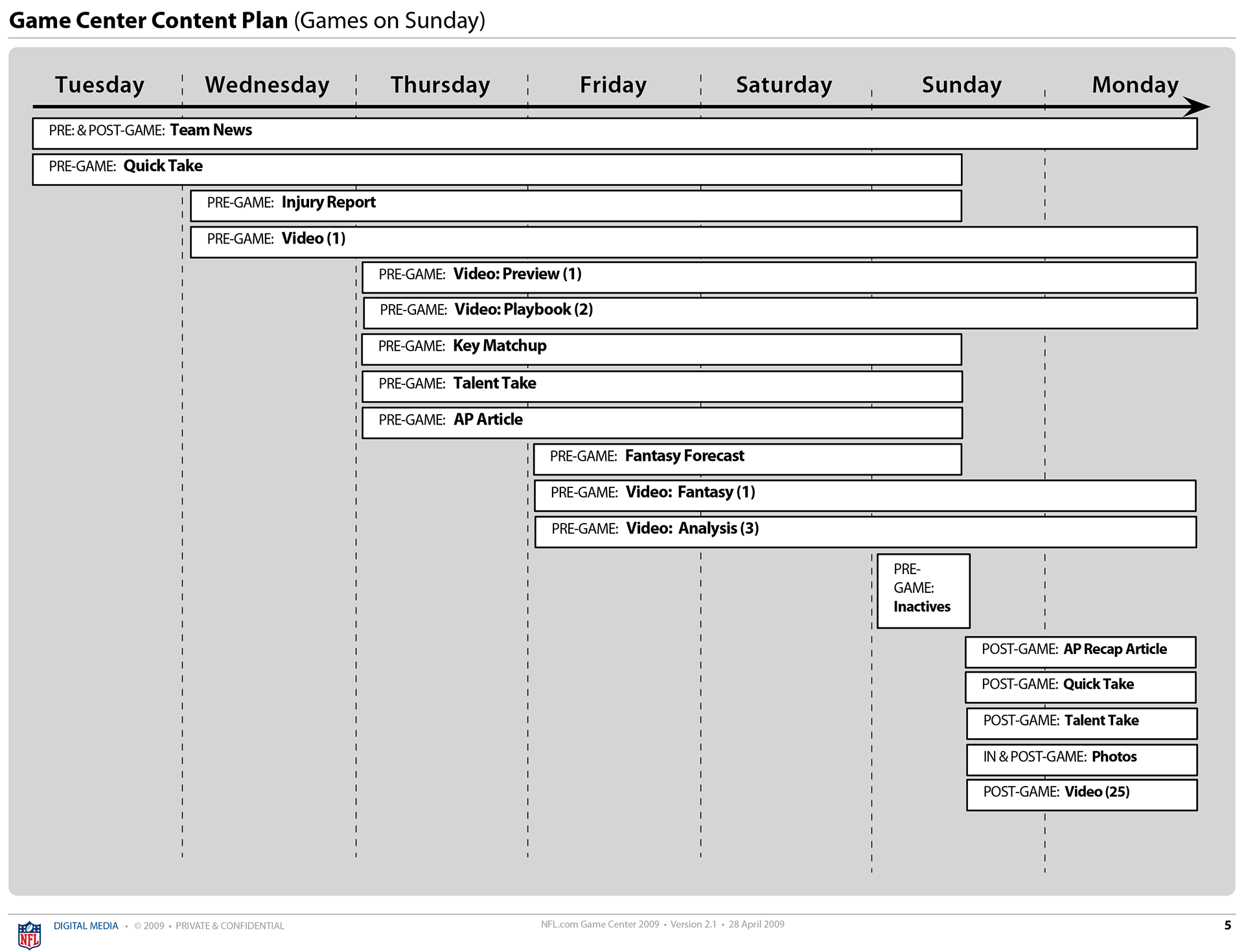
Discussions with the editorial team helped shape a content strategy that would extend Game Center's relevance throughout the week in a predictable and repeatable way. For example, creating content on Tuesday, and then ramping up with additional content through the week provided reasons for fans to come back each day.
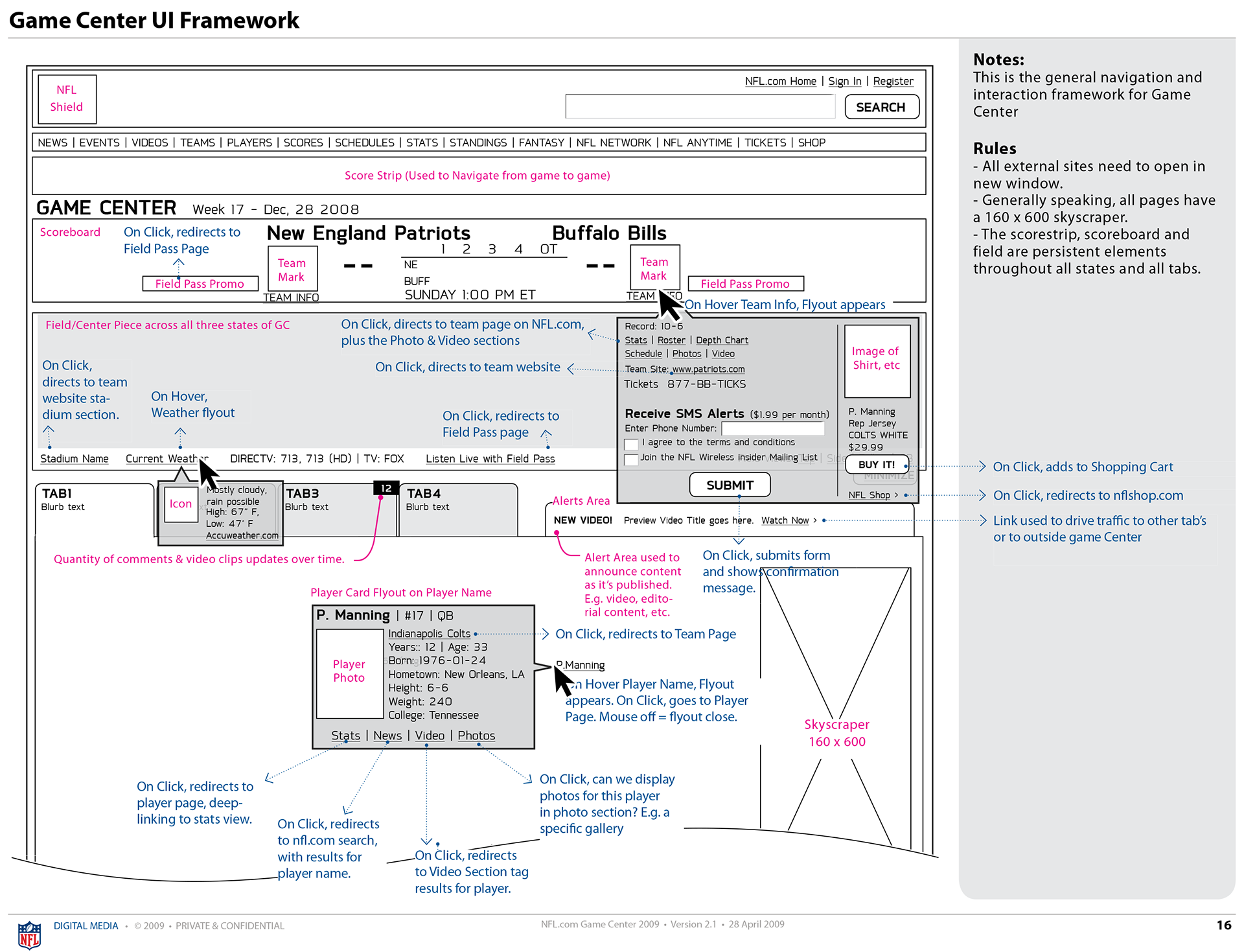
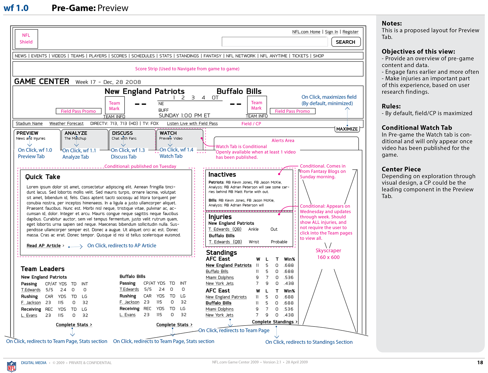
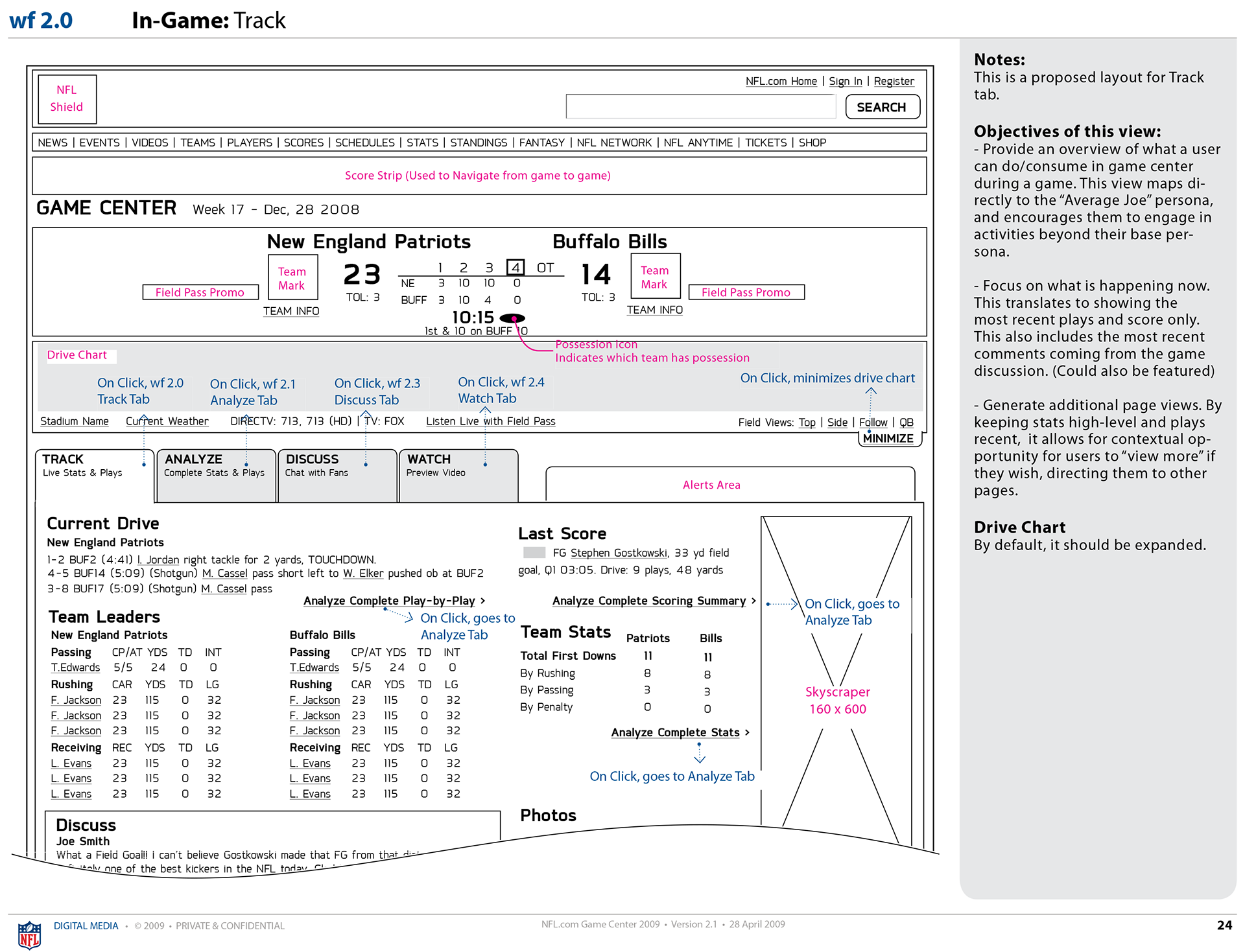
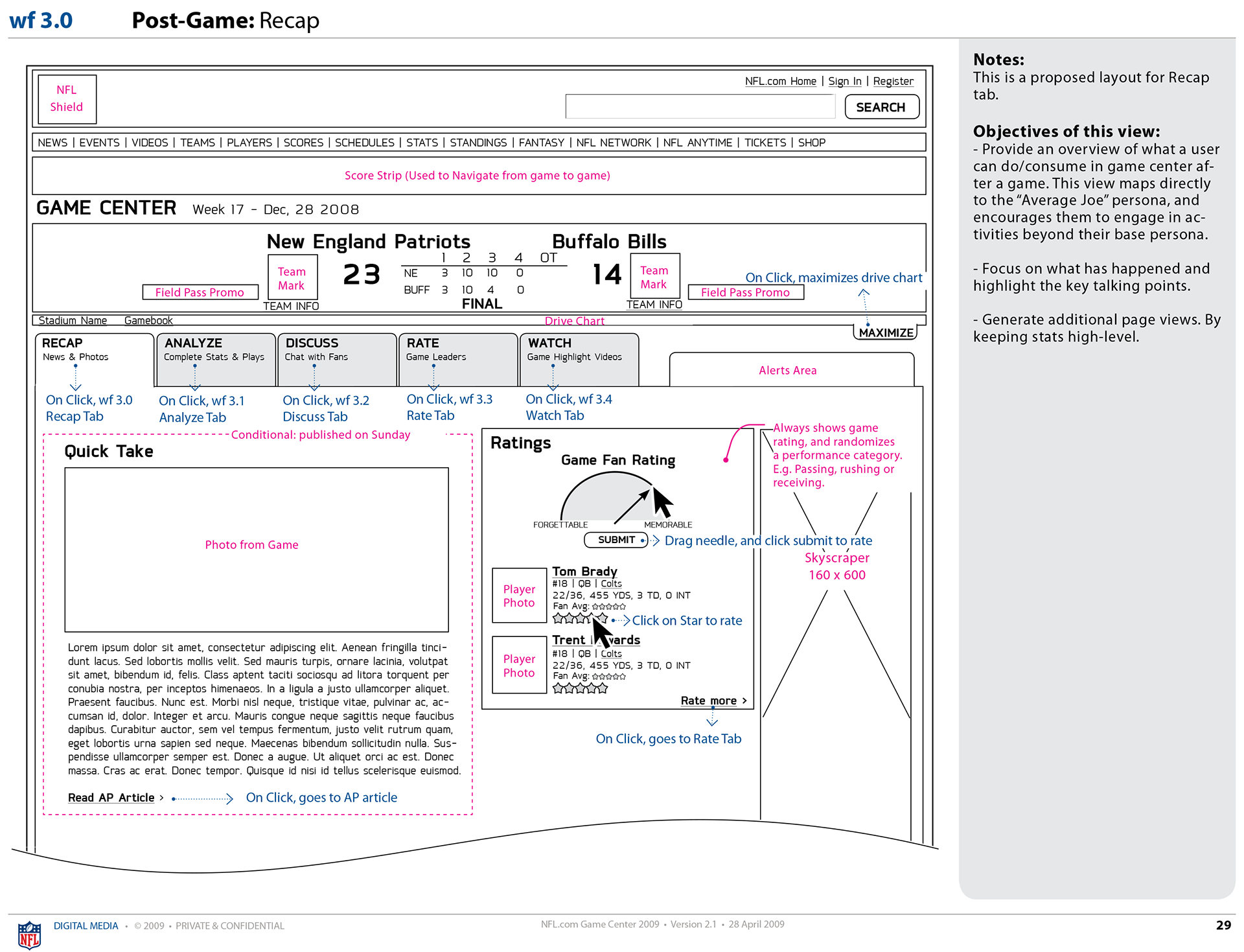
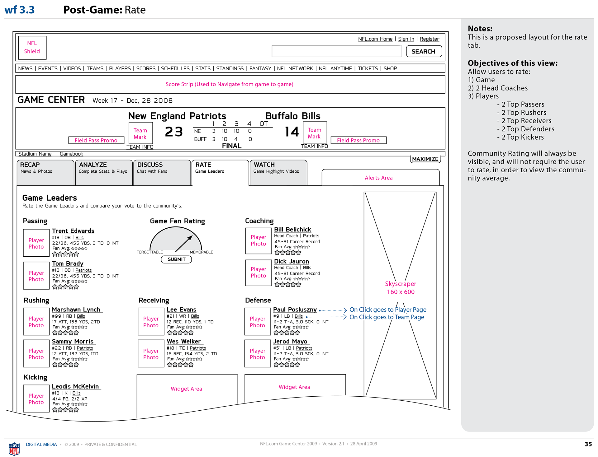
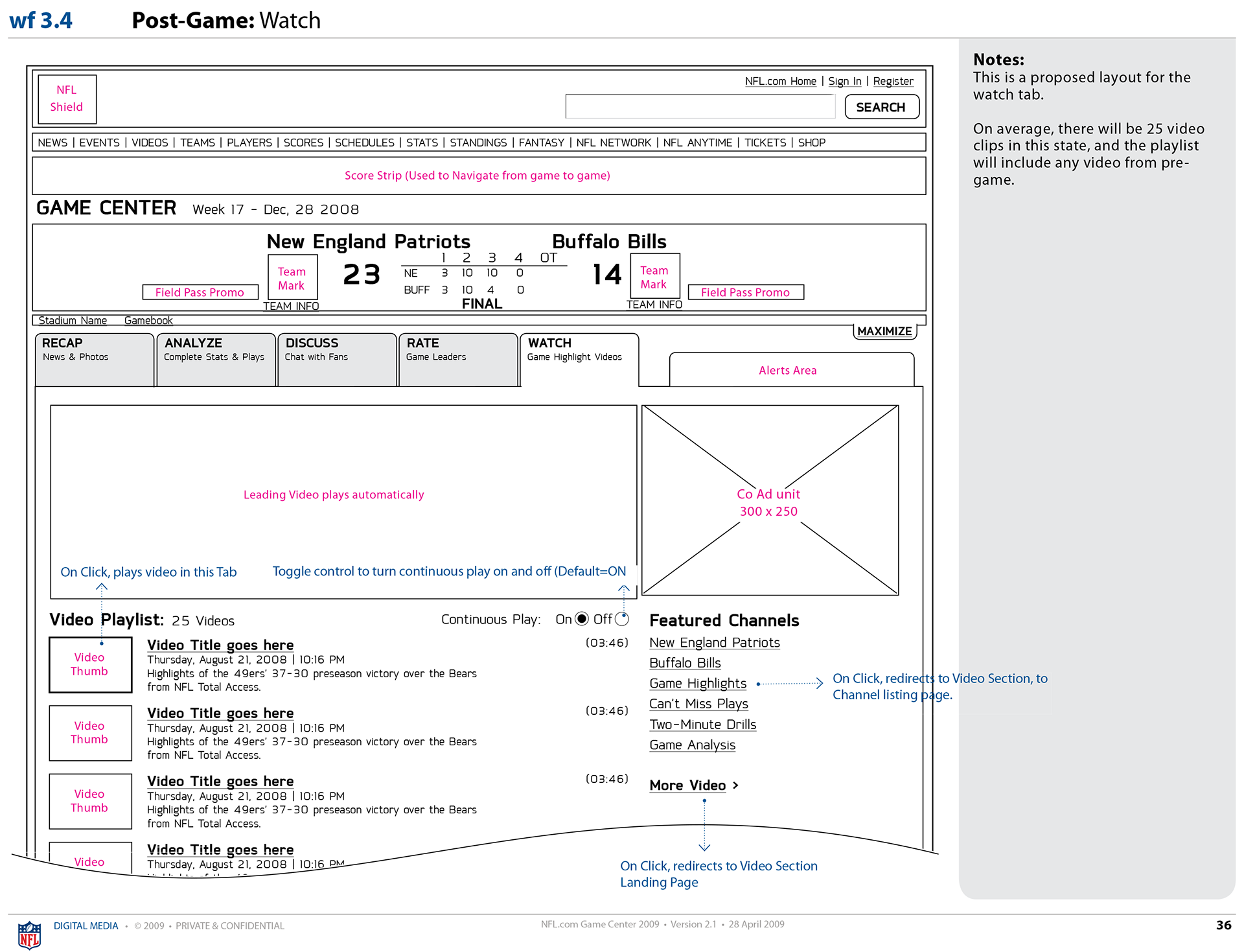
User Experience: Wireframes
These are some samples from a complete wireframe deck, which included detailed annotation for various audiences to consume. These included functional specifications to ensure developers had the direction and details needed to build as intended.

Visual Design
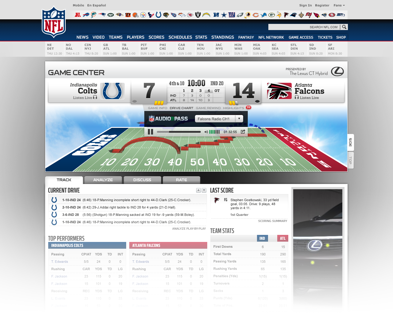
The UI team created mockups based on the UX in the wireframes. These along with a high-fidelity drive chart prototype, would provide stimuli for usability testing. Note the prominent integration of other NFL products such as Audio Pass (to listen a game) and Game Pass (to watch a game).

Audio Pass integration
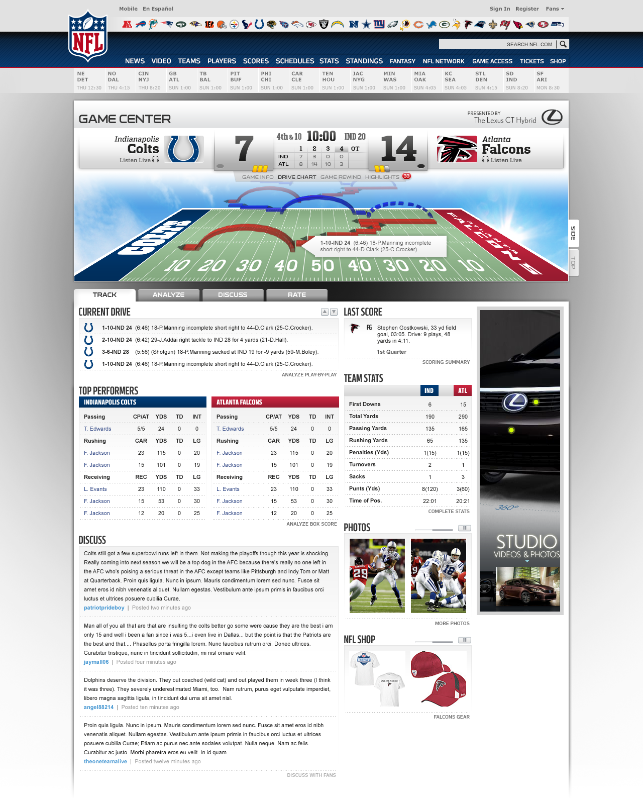
Drive Chart in action
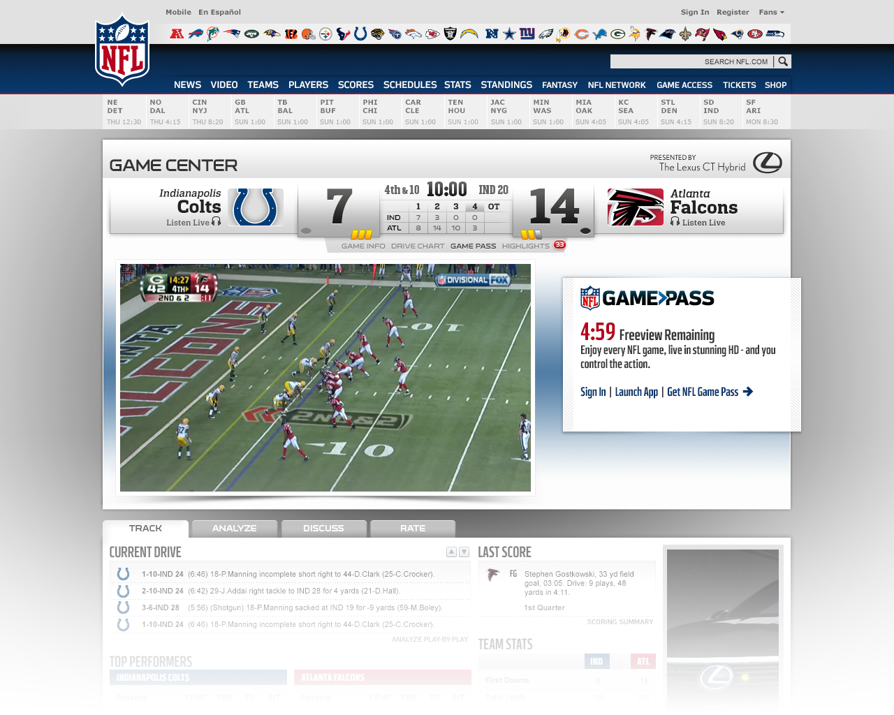
Game Pass integration
Usability Test
Since Game Center is the most used product on nfl.com, it was critical that the redesign was intuitive and reflected the goals of the project. To ensure these things, we conducted a usability study using a robust interactive prototype that felt as "real" as possible.
Approach
•Moderated in-person test with 8 participants (1:1).
•A series of tasks were given to participants across Pre-Game, In-Game and Post-game states.
•Used a fully designed interactive prototype, that could be switched to Pre-Game, In-Game and Post-game states.
Key Findings
•From a content and feature standpoint, participants felt that the new Game Center design met their expectations.
•Participants thought that in-game video highlights were missing from the experience.
•Participants considered the new design much better than any of the competitors at the time.
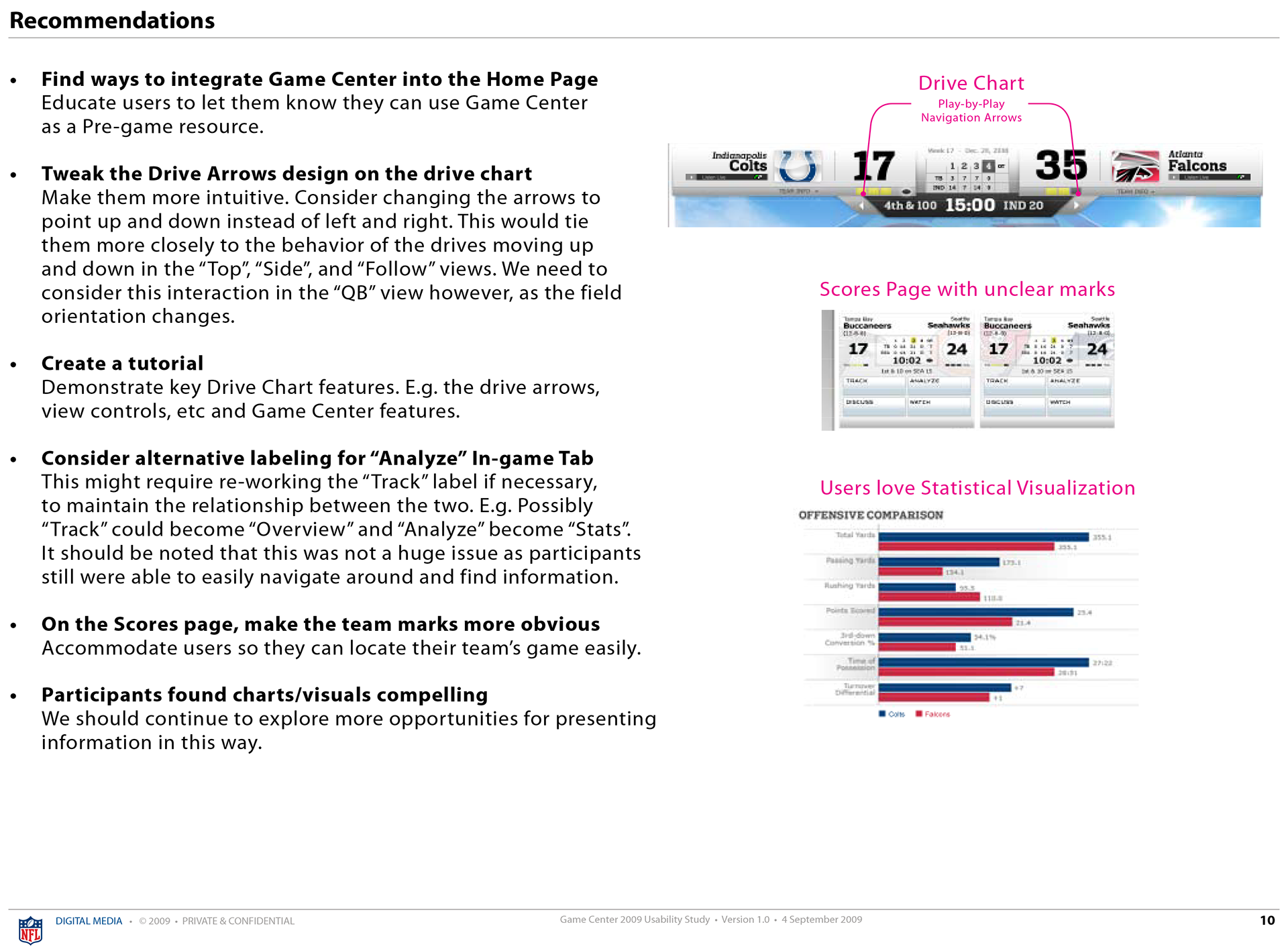
•The Drive Chart “wowed” participants; especially the run vs. pass visualization in the “Side” view.
•There was a learning curve with the Drive Chart though, especially with the arrows for moving through time.
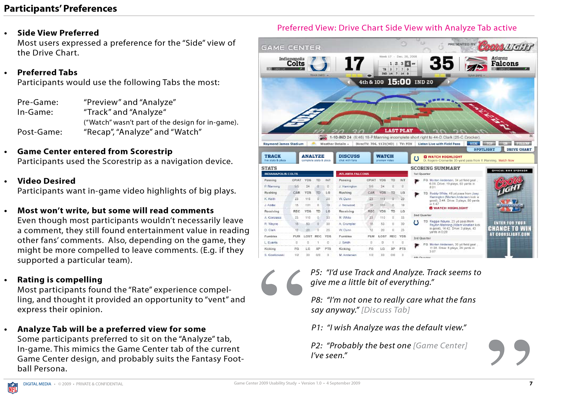
•Participants loved the visual of the team matchup in the "Analyze" page.
•However, a few participants questioned if "Analyze" was the best term.
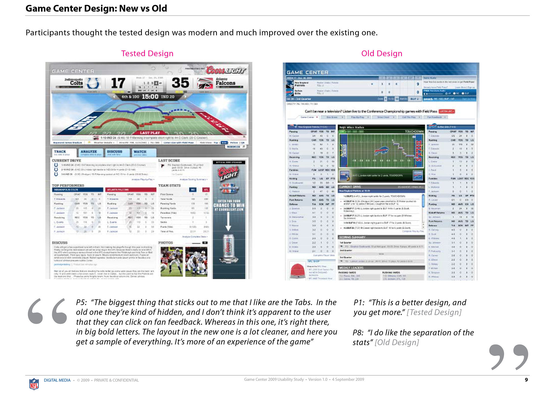
•Participants thought the new design was modern and much improved over the existing one.